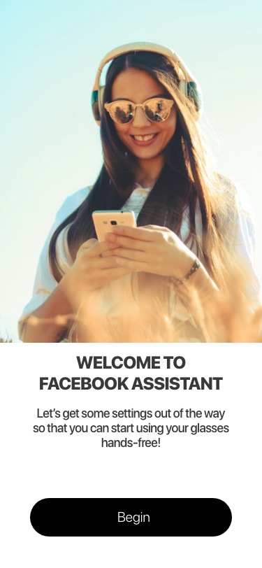
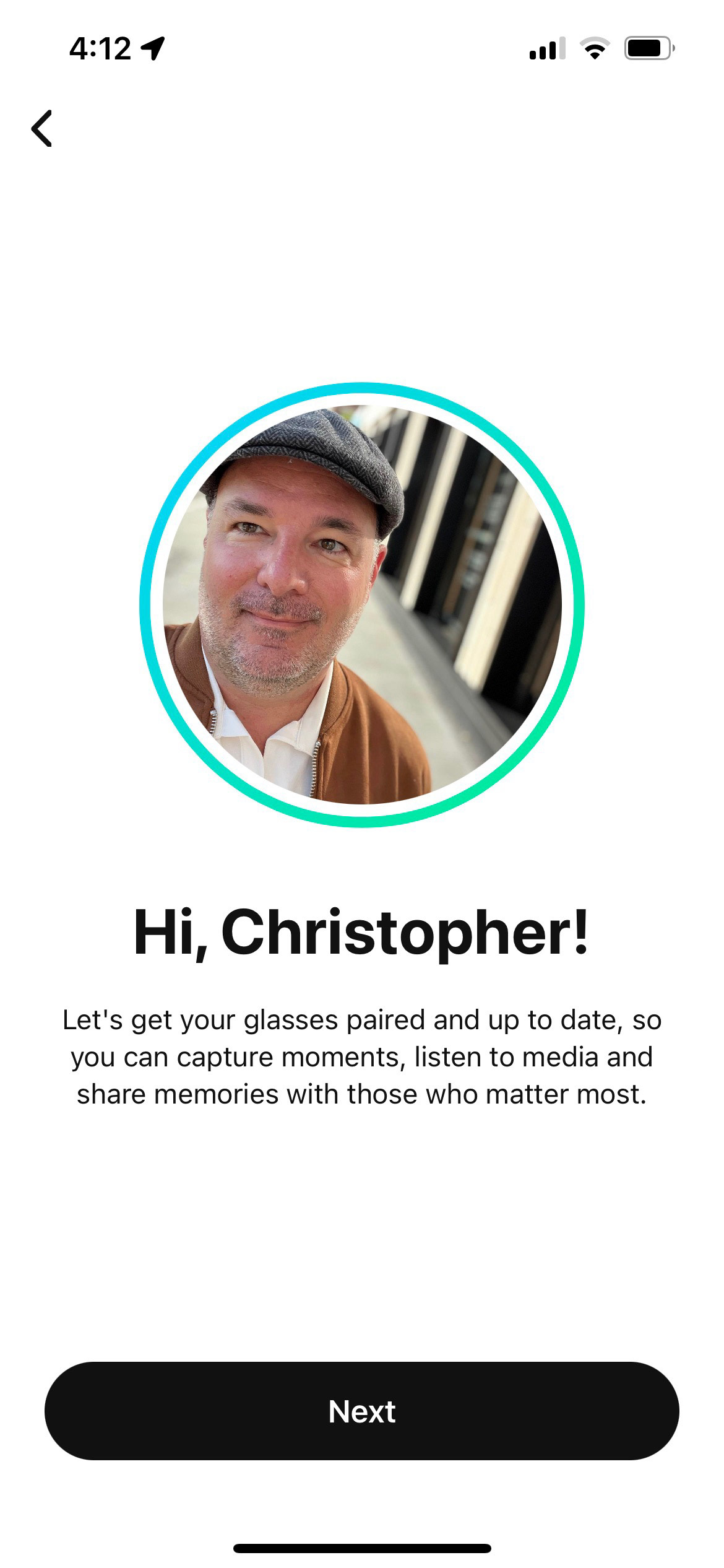
What is Facebook Assistant OOBE?
The journey began with a visionary idea for an Oculus AR product, which soon evolved into Facebook's groundbreaking entry into the realm of wearable devices powered by Facebook services. In collaboration with Luxotica, the esteemed eyewear conglomerate selected as Facebook's manufacturing partner, our aim was to introduce a wearable device integrated with Facebook Assistant, the voice-enabled AI. Understanding that the target audience primarily consisted of Luxotica's customer segment, characterized by a lesser degree of tech-savviness, we recognized the pivotal role of the Out of Box Experience (OOBE) in shaping their initial interactions with the product. By prioritizing user-friendly and intuitive design principles, our goal was to create an OOBE that seamlessly familiarized users with the device's functionalities and Facebook's innovative services. Through thoughtful consideration of the target audience's needs and preferences, we aimed to deliver an exceptional and accessible customer experience that would transcend any technological barriers, ultimately empowering users to fully embrace the wearable device powered by Facebook Assistant.
What did I contribute?
As the Senior Product Designer on the Facebook Assistant team, my role encompassed spearheading the definition and design of the Out of Box Experience (OOBE) specifically tailored for Facebook Assistant on the new wearable device. Collaborating with a dedicated Content Strategist and another Senior Product Designer specializing in AR design, our team worked synergistically to bring this vision to life. Additionally, close collaboration with the team responsible for designing and delivering the companion app, which housed our OOBE, ensured a seamless and cohesive user experience across all touchpoints. Reporting to the larger Assistant team, I received guidance on voice design patterns and branding, allowing for a consistent and aligned experience with the broader Facebook Assistant ecosystem. By leveraging the collective expertise and collaboration within our cross-functional team, we aimed to create an OOBE that not only educated and guided users effectively but also reflected the core principles and brand identity of Facebook Assistant.
What was the problem?
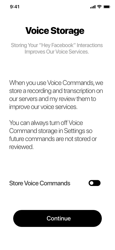
The primary objective of the Out of Box Experience (OOBE) for Facebook Assistant on the new wearable device was to facilitate a smooth transition for our customers into a hands-free relationship with the technology, achieved through the use of voice commands or gestures directly on the device. Extensive research indicated that this wearable would likely be the first of its kind for our target audience, with limited familiarity in using voice commands in public settings. Consequently, the key focus of the OOBE was to introduce customers to the features and functionality of the device, fostering a sense of comfort and confidence in utilizing the technology. In parallel, a secondary goal of the OOBE was to cultivate trust in the Facebook brand and its suite of services, as research highlighted customer apprehension regarding a wearable device powered by Facebook. To address this, my experience design placed a strong emphasis on transparency and establishing trust through clear communication and intuitive interactions, allowing users to feel confident in their engagement with the Facebook Assistant and its capabilities. By aligning the OOBE objectives with user research insights, we aimed to create an immersive and trustworthy experience that not only introduced customers to the device's capabilities but also bolstered their confidence in engaging with Facebook services through the wearable device.
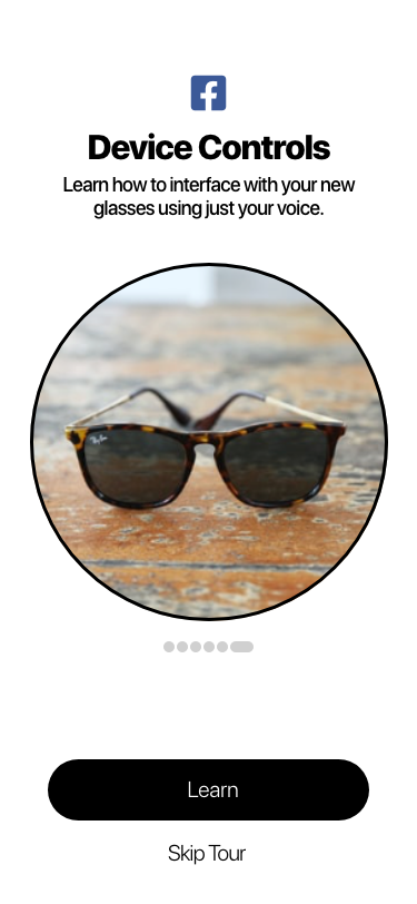
How did I execute on the goals?
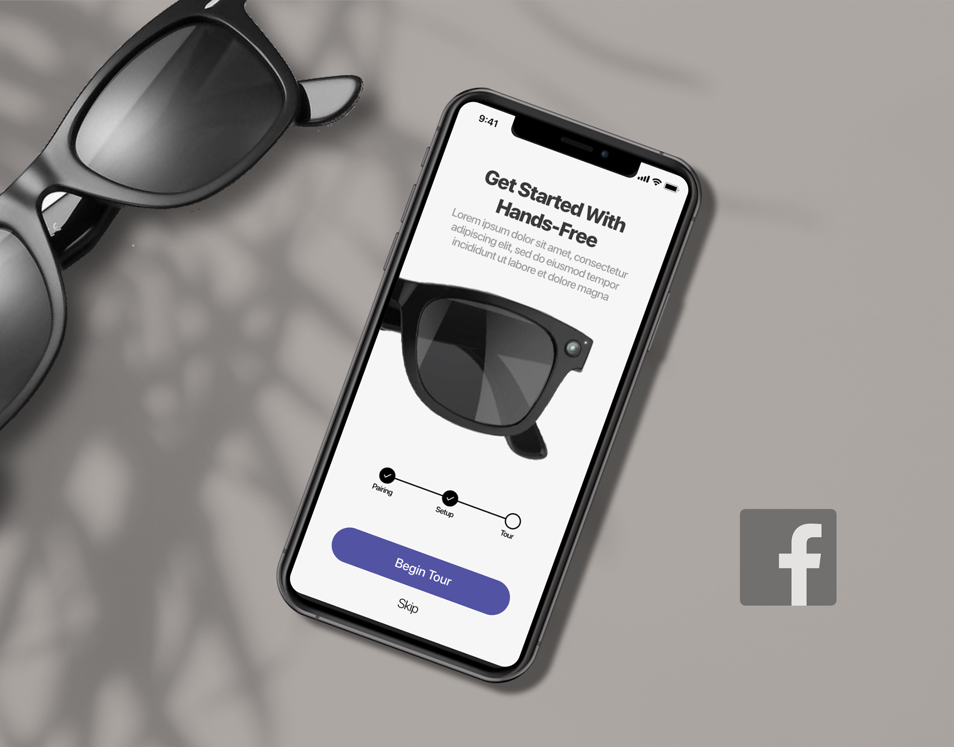
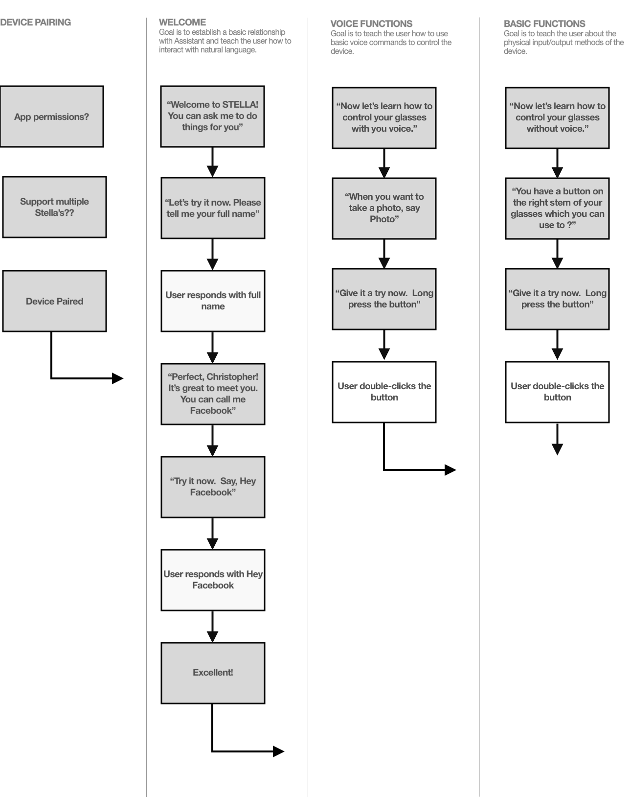
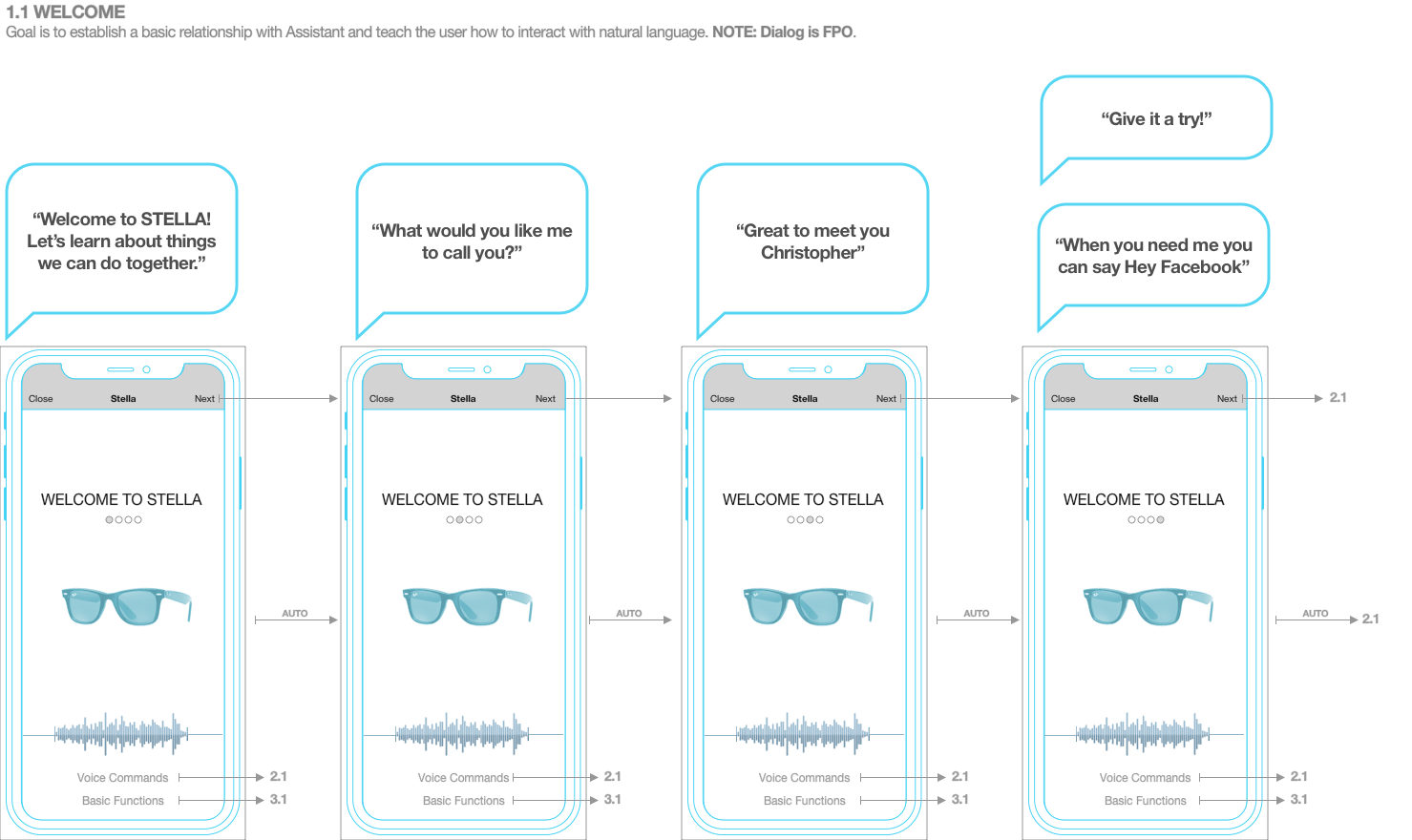
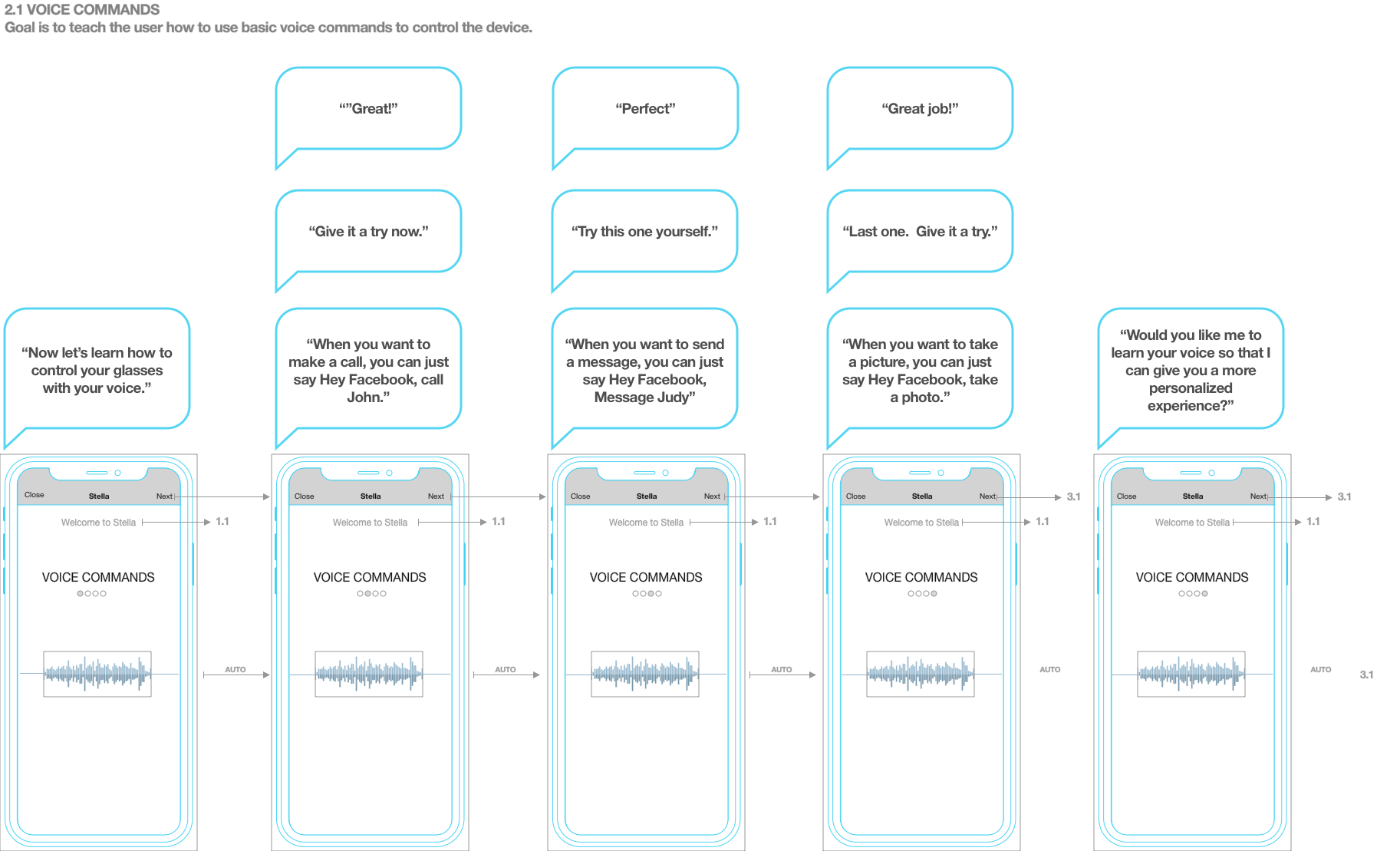
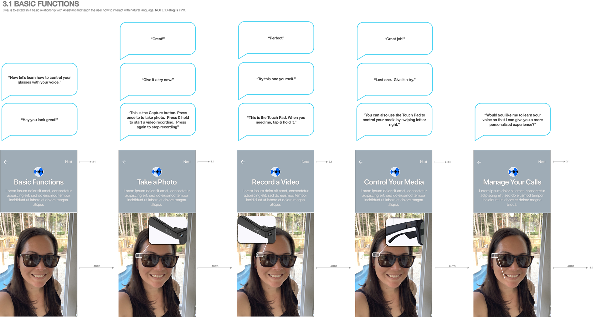
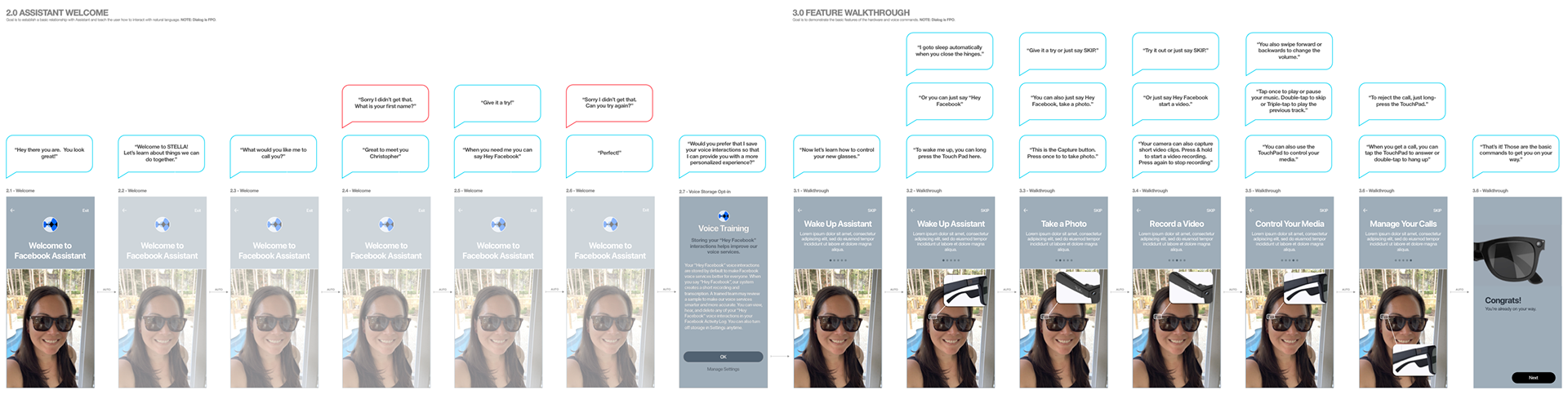
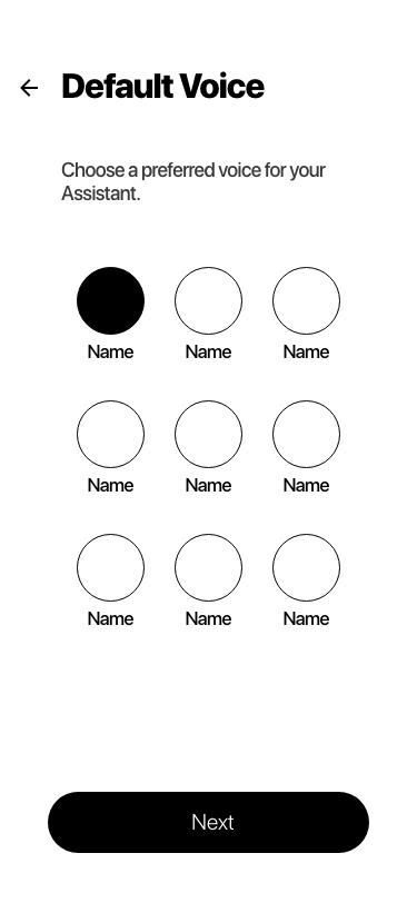
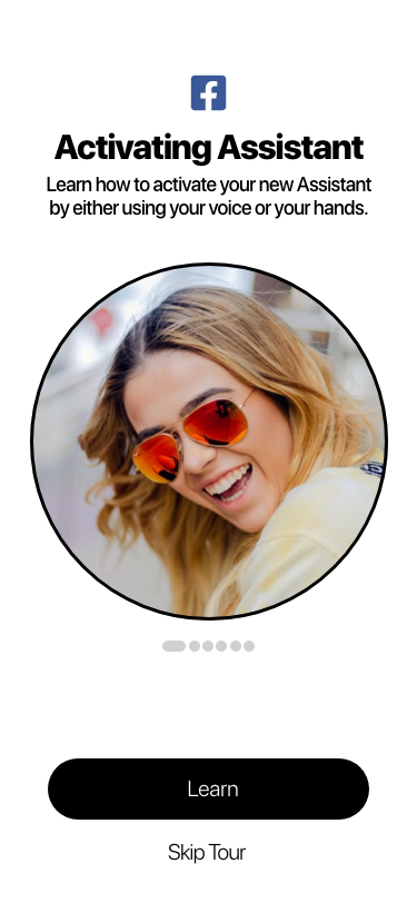
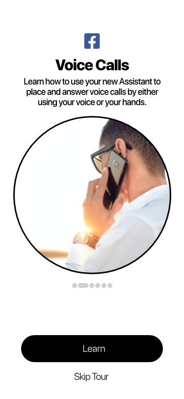
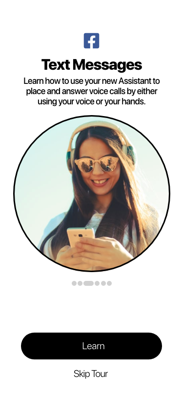
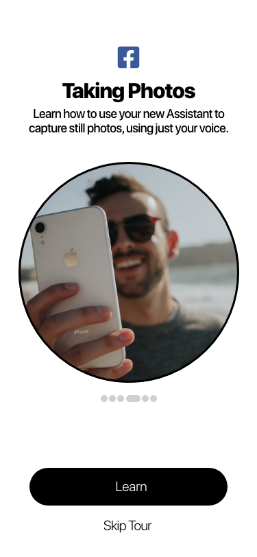
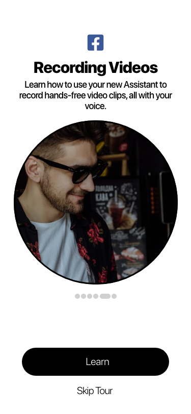
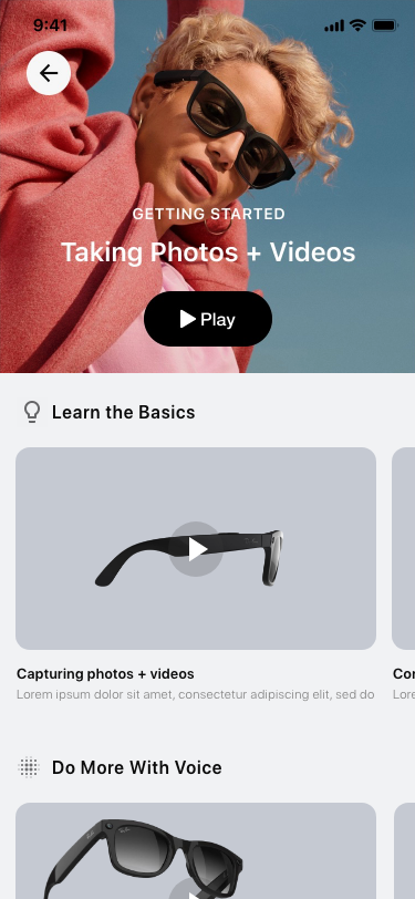
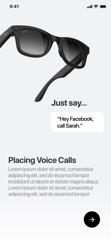
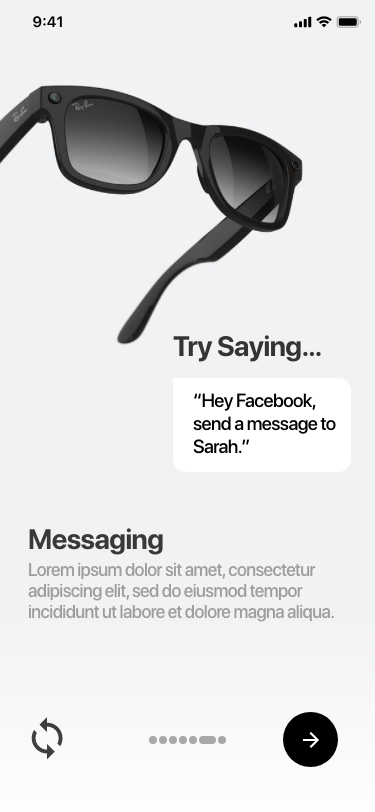
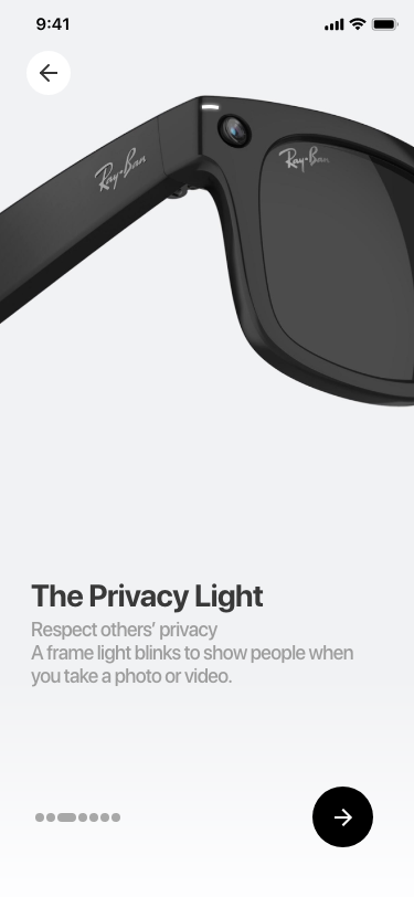
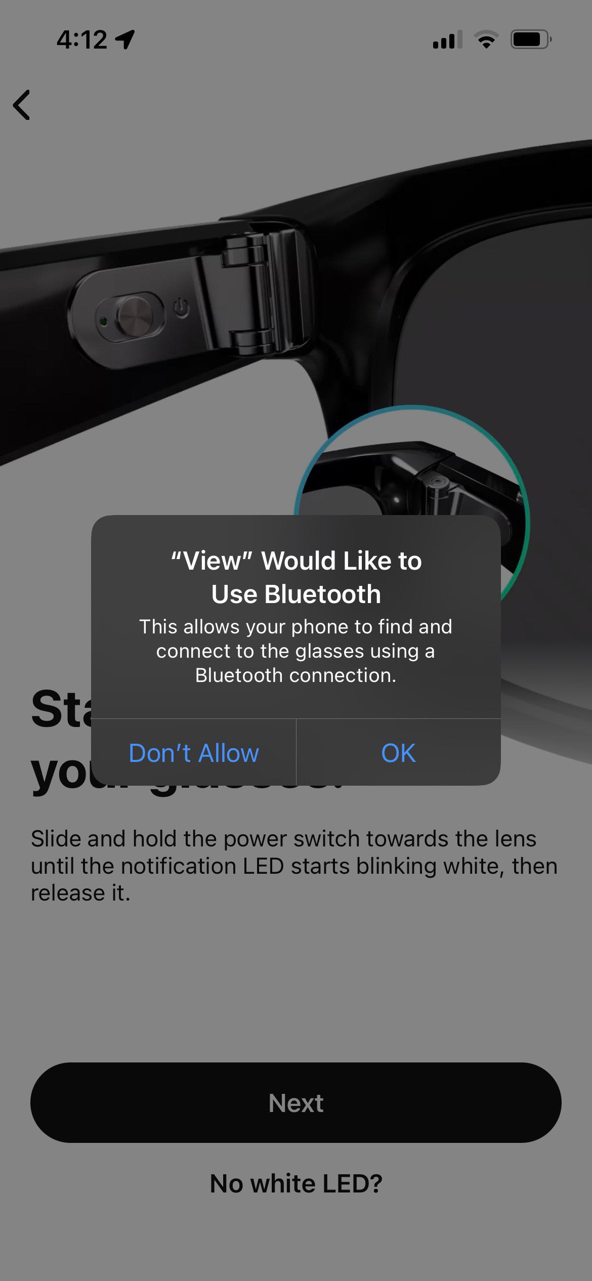
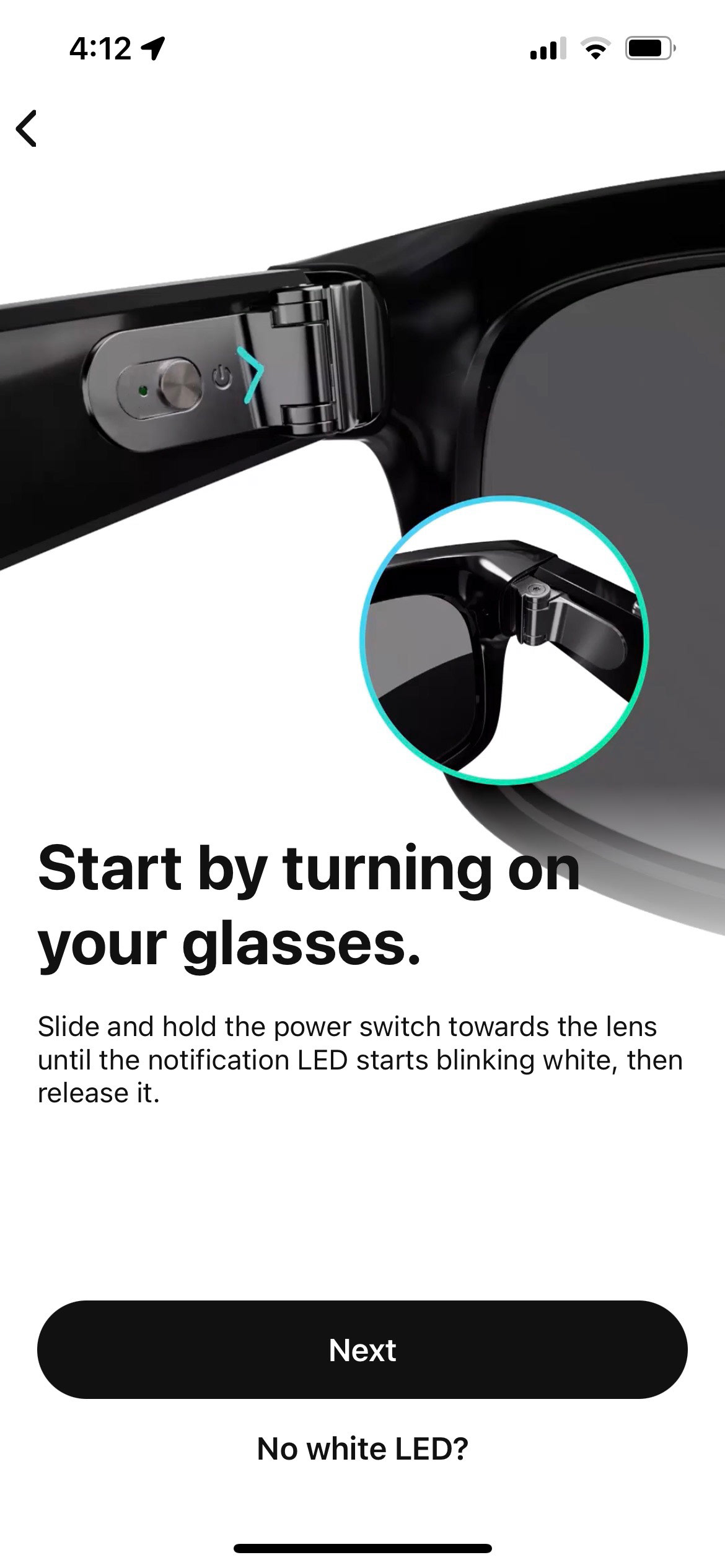
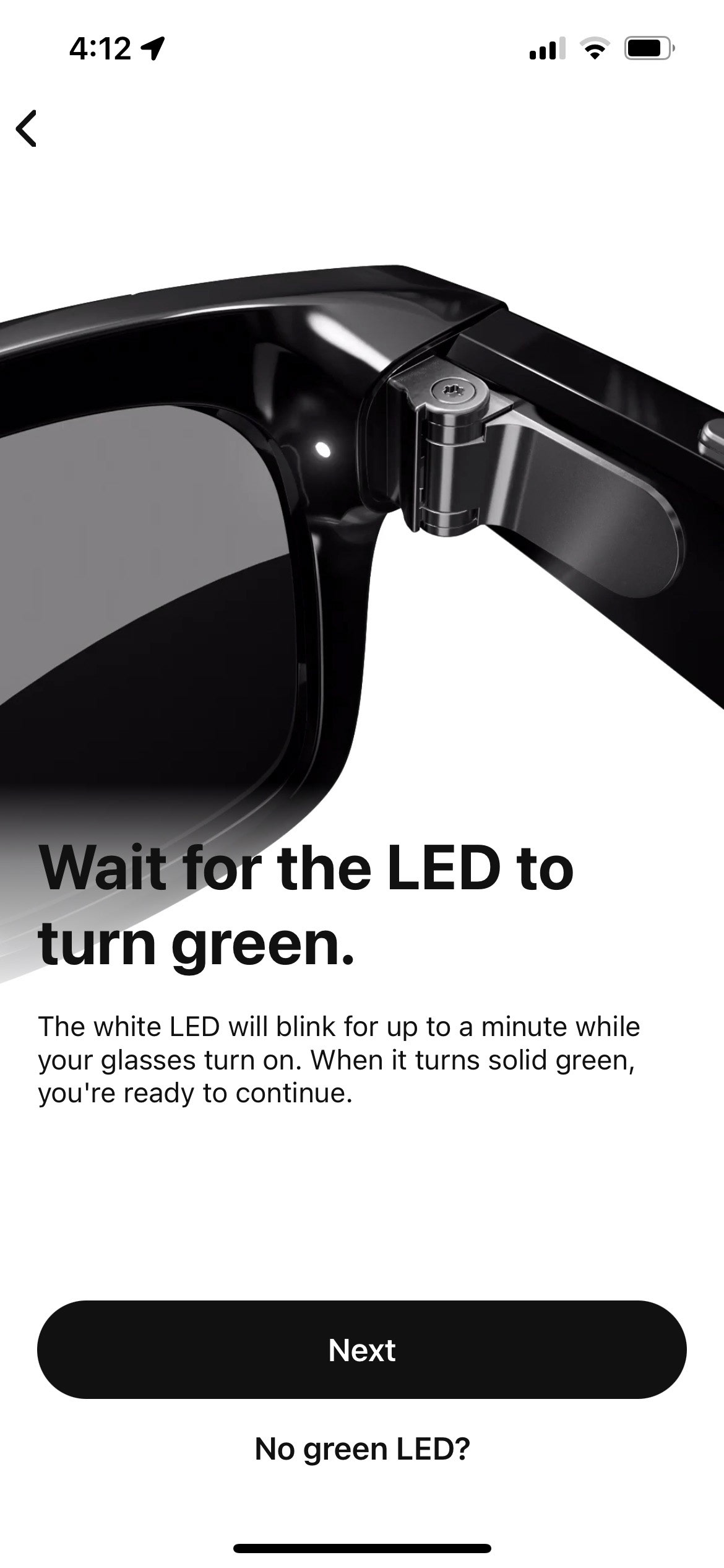
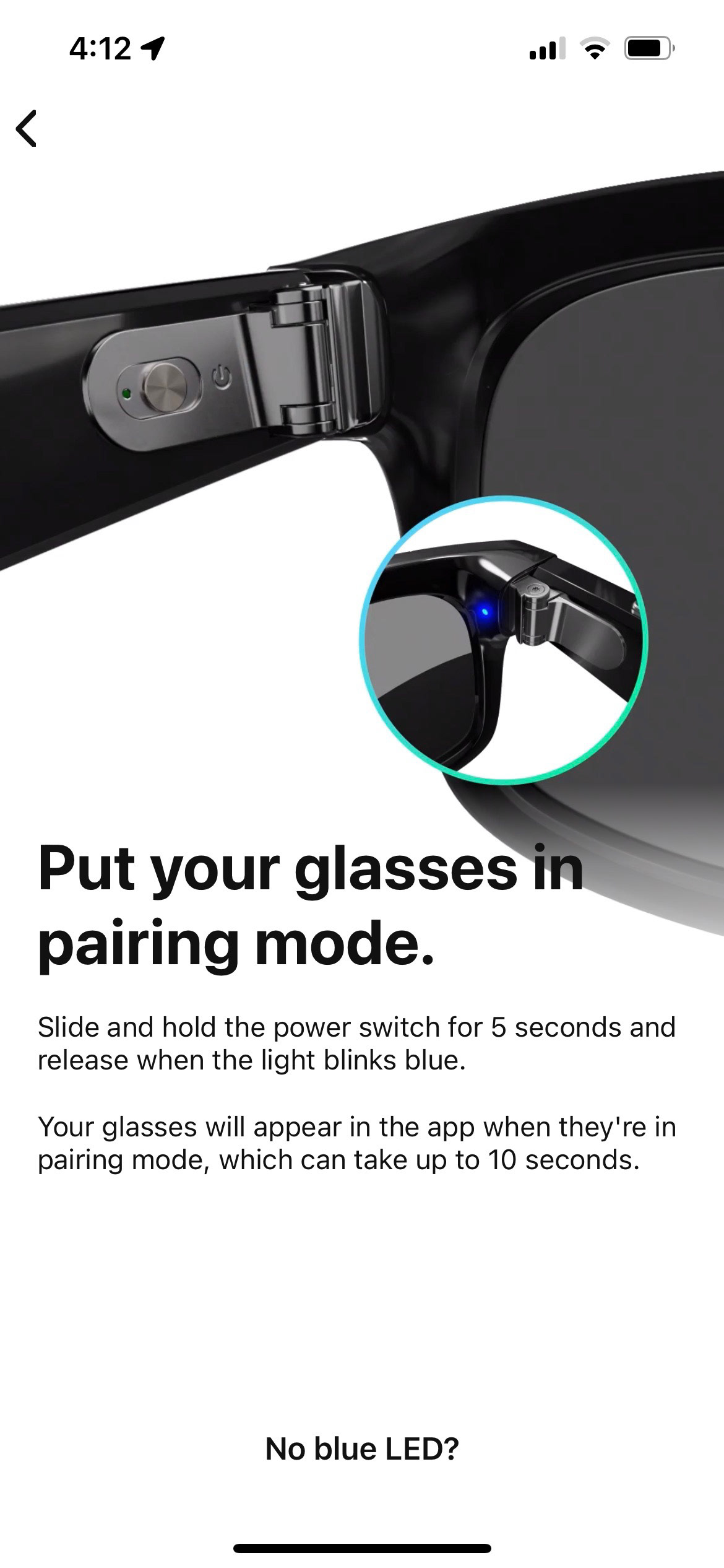
Within the larger context of the product's Out of Box Experience (OOBE), the Facebook Assistant OOBE design constituted a specific component, as the companion app team primarily handled the initial onboarding and new user experience (NUX), including device pairing functions. Once those elements were completed, the app transitioned into our Assistant setup and product tour. In designing the product tour, our approach focused on leveraging the Assistant itself to establish a meaningful relationship between the customer and the Assistant. The AI would autonomously guide the customer using natural language, showcasing its ability to listen and accurately respond to user commands. This approach aimed to instill trust in the customer, demonstrating that the Assistant was capable of understanding their voice and providing relevant and helpful assistance. By allowing the Assistant to speak for itself and facilitating seamless interactions, our goal was to build a strong foundation of trust and confidence in the AI's capabilities, ultimately enhancing the overall user experience and fostering a positive customer relationship with the Facebook Assistant.
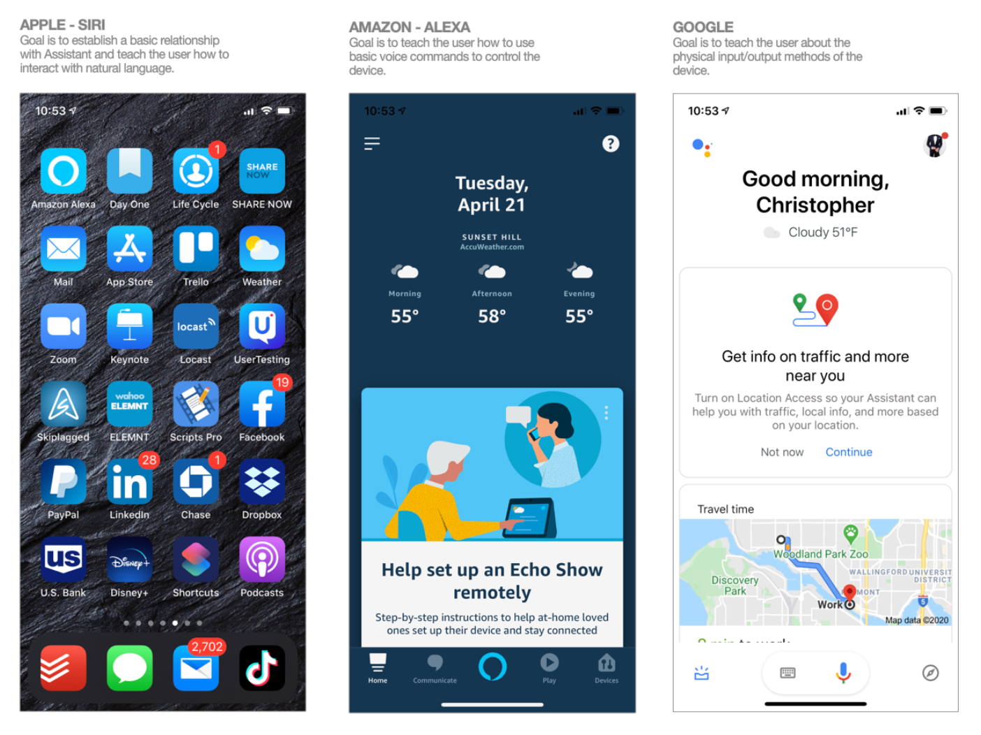
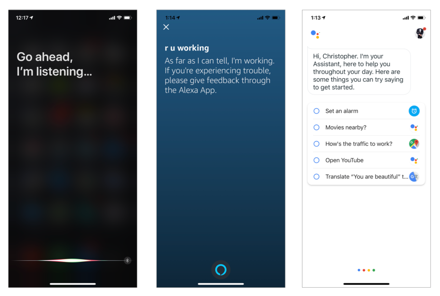
Competitive Analysis
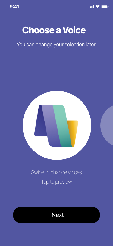
To effectively establish the relationship between the user and the AI, I initiated the design process by outlining a conversation structure that would serve as the foundation for our interactions. This structure consisted of three distinct areas of focus, each centered around a specific outcome. The first area aimed to introduce the user to the capabilities of the Facebook Assistant, showcasing its potential for assisting with various tasks and providing relevant information. The second area focused on guiding the user through personalized settings and preferences, allowing them to customize their experience and establish a sense of ownership. Lastly, the third area aimed to address any concerns or questions the user may have, emphasizing transparency and building trust in the Facebook Assistant. By creating a thoughtful conversation structure that addressed these key areas, I was able to establish a strong and meaningful relationship between the user and the AI, fostering a positive and engaging user experience throughout the OOBE.
Using prototypes to test concepts
During the design process, our teams found themselves divided on the role of the companion app within the overall experience. One camp advocated for solely utilizing the glasses for the product tour, as it aligned with the intended usage pattern of the wearable device. On the other hand, another camp believed that the companion app could provide valuable visual cues and structure to reduce cognitive load during the product tour. Recognizing the potential benefits, I agreed with the latter camp and took the initiative to create a video mockup illustrating the concept. By presenting this visual representation, I aimed to demonstrate how the companion app could enhance the overall experience by providing additional support and guidance, ultimately helping users navigate the product tour more effectively.
Conversation design
Using the prototype showcasing the concept of utilizing the companion app, I successfully gained support for its inclusion in the overall experience. With this approval, our next focus was on fleshing out the actual conversations that would guide the customers through each area of focus. This involved designing the dialogue and interactions that would occur between the user and the AI assistant within the companion app. I aimed to create a natural and intuitive conversation flow that would effectively introduce and educate users about the features and functionalities of the wearable device. By carefully crafting these conversations, I sought to establish a seamless and engaging user experience that would build trust and familiarity with the Facebook Assistant.
Using innovative thinking
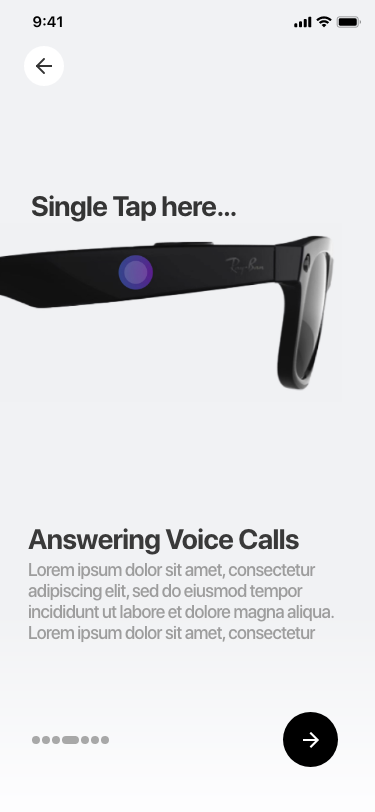
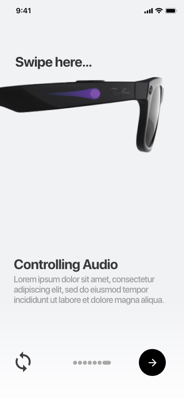
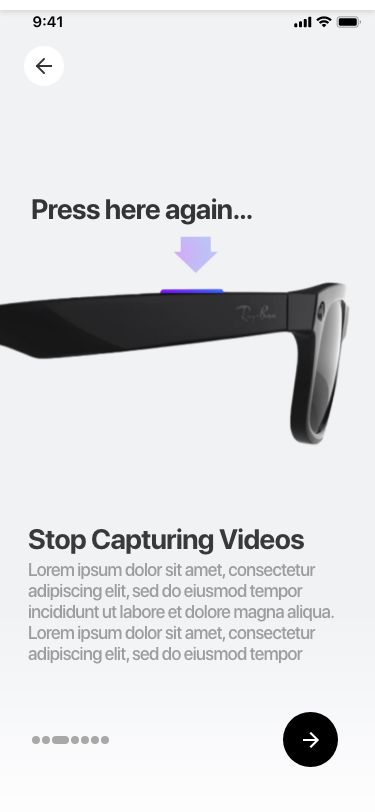
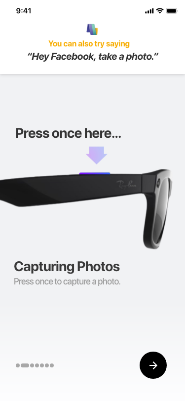
One of the challenges I encountered while designing the product tour experience was establishing a strong connection between the visual cues displayed on the device and the physical controls and gestures used on the glasses. I recognized the importance of users developing muscle memory for operating the gestures on a pair of glasses that they couldn't physically see on their heads. Drawing from my experience with AR/VR technology during my time at Oculus, I proposed a solution to address this challenge. By leveraging visual overlays or augmented reality techniques, I could provide real-time guidance and feedback within the user's field of view, aligning the visual cues with the appropriate physical gestures. This approach aimed to enhance the user's understanding and familiarity with the device's controls, enabling them to interact effortlessly with the wearable and reinforcing the muscle memory necessary for a seamless user experience.
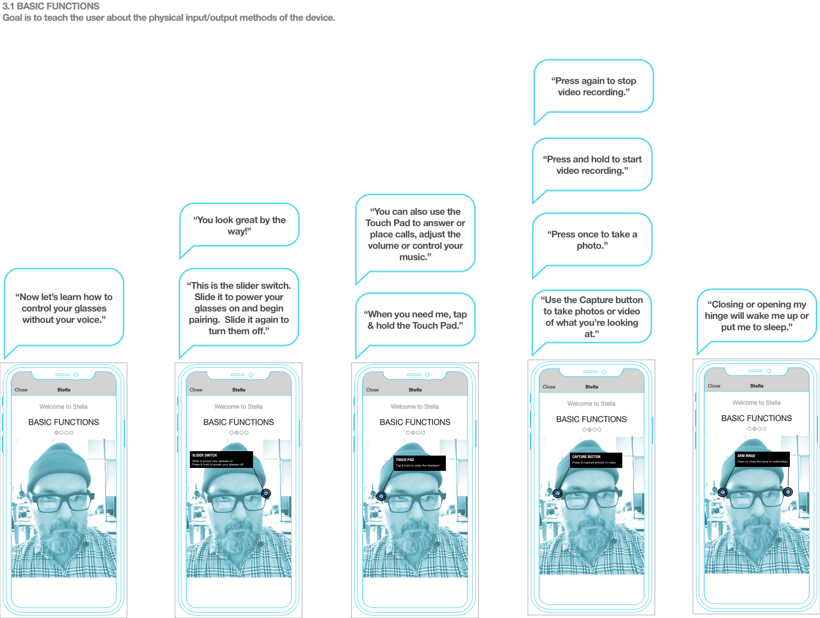
To address the challenge of connecting visual cues with physical controls and gestures on the glasses, I proposed utilizing the front-facing camera on the device to provide a live video feed of the customer wearing the glasses. By overlaying AR targets on the video feed, we could visually indicate the exact locations on the glasses where the customer needed to touch or interact to activate the hardware controls. This approach effectively created a virtual mirror, allowing customers to see themselves wearing the glasses and providing clear visual guidance on how to interact with the device. This combination of live video feed and AR targets aimed to enhance the understanding and accuracy of the gestures, enabling customers to develop the necessary muscle memory for smooth and intuitive interaction with the wearable.
Experiment with visual design
As we transitioned from wireframe concepts to visual design, we faced challenges due to the ongoing development of the hardware and the limited visual styles available from Luxotica, who would be responsible for marketing and sales channels. Additionally, I discovered that another team at Facebook was concurrently working on a brand expression for Assistant, which needed to have its own distinct presence within the overall experience.
To address these challenges, I took a collaborative approach. I closely collaborated with the Assistant team working on the brand expression to understand their design direction and incorporate it into the visual design of the OOBE. I also engaged in regular communication with the Luxotica team to ensure alignment and leverage any available visual styles that could be used in the design.
By combining the brand expression of Assistant with any available visual styles from Luxotica, I aimed to create a cohesive and visually appealing design that would support the overall experience. This required careful consideration and adaptation to ensure that the visual design complemented both the hardware aesthetics and the brand expression of Assistant, while still being distinctive and engaging for the users during the out-of-box experience.
Given the evolving nature of the project and the collaboration with the companion app team, I recognized the need for alignment and consistency in visual styles between the wearable device's interface and the companion app. To achieve this, I initiated a collaboration with the companion app team to ensure that our visual styles were complementary and created a cohesive user experience.
We conducted regular design reviews and shared our progress, allowing for feedback and iteration on both sides. By aligning our visual styles and ensuring consistency, we aimed to provide a seamless transition for users between the wearable device and the companion app.
Throughout the collaboration, we kept in mind the unique constraints and considerations of the wearable device, such as screen size and interaction capabilities, while also maintaining consistency with the larger Facebook design language and branding guidelines.
By working closely with the companion app team, we were able to create a unified visual experience that not only reflected the brand identity but also provided a seamless and intuitive user journey across both the wearable device and the companion app.
Being flexible with design concepts
As I delved deeper into the design of the OOBE, I encountered challenges with implementing the AR concept I had proposed. One of the primary concerns that arose was the desire to keep the overall length and complexity of the OOBE as minimal as possible. Every screen and step in the process was carefully evaluated to ensure a streamlined and efficient user experience.
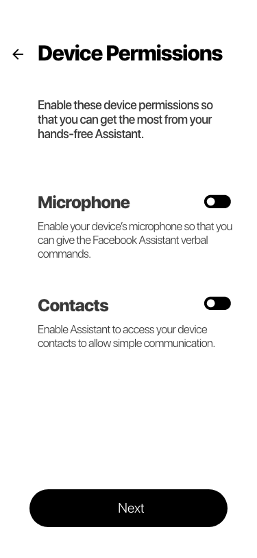
One particular concern that arose regarding the AR concept was the issue of requesting camera permissions from the user. We wanted to strike a delicate balance between introducing the AR feature at an appropriate point in the process while also maintaining the user's trust. Introducing it too early could potentially raise privacy concerns and erode trust, while introducing it too late might render the feature less relevant or reduce its impact.
Considering these concerns, we decided to reassess the feasibility and impact of the AR concept within the context of the overall OOBE. We explored alternative approaches that would maintain the focus on simplicity and minimize potential friction points for the user. This involved carefully prioritizing the key information and interactions that were most critical to the initial setup and user onboarding process.
By reevaluating the AR concept and its potential impact on the overall user experience, we were able to make informed decisions that prioritized simplicity, trust, and relevance. Ultimately, this allowed us to create an effective and streamlined OOBE that provided users with a smooth introduction to the wearable device and its features.
In anticipation of scenarios where customers might refuse to grant camera permissions, I recognized the need to create an alternate flow that would accommodate such situations. Since the front-facing camera was a crucial component for the AR concept, it became evident that without access to the camera, the feature would be rendered useless.
To address this challenge, I iterated on the user flows and created an alternative path for customers who declined camera permissions. This alternate flow would bypass the AR component and provide users with an alternative set of instructions and interactions that would still allow them to effectively set up and familiarize themselves with the wearable device and its functionalities.
By designing a fallback option, I ensured that customers who opted not to grant camera permissions could still have a meaningful and complete out-of-box experience. The alternative flow would provide clear guidance and instructions, utilizing other available interactions and visual cues to enable users to navigate and interact with the device without relying on the AR aspect.
This approach allowed me to cater to a broader range of user preferences and privacy concerns, ensuring that all customers could enjoy a comprehensive and tailored onboarding experience, regardless of their decision regarding camera permissions.
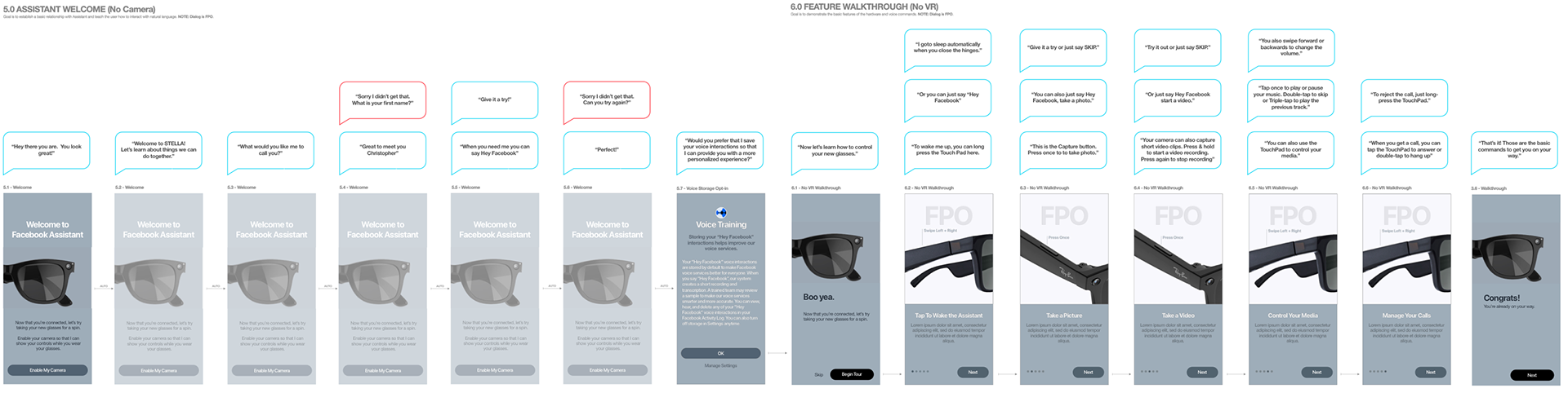
After careful consideration and weighing the development time and complexity of the user experience, the team collectively decided to abandon the AR concept. This decision was reached with the goal of streamlining the user flow and ensuring a smoother and more efficient onboarding experience for the customers. I agreed with this decision, as it would allow us to focus on a more feasible and user-friendly solution.
With the AR concept set aside, it was time to explore alternative user flows that would provide a straightforward and intuitive experience for users. I took this opportunity to reassess the goals and objectives of the out-of-box experience (OOBE) and reframe our approach.
The new user flow would prioritize simplicity and clarity, enabling users to quickly understand and interact with the wearable device. We iterated on the wireframes and user flows, making adjustments and refinements to create a more streamlined and effective onboarding process. The revised flow would guide users through the essential steps, introducing them to key features and functionalities in a clear and concise manner.
By shifting our focus to a new user flow, we aimed to optimize the user experience, minimize complexity, and ensure a successful and engaging onboarding journey for customers. This approach allowed us to align the design with the development capabilities and create a more practical and achievable solution.
A shared understanding of who we are designing for
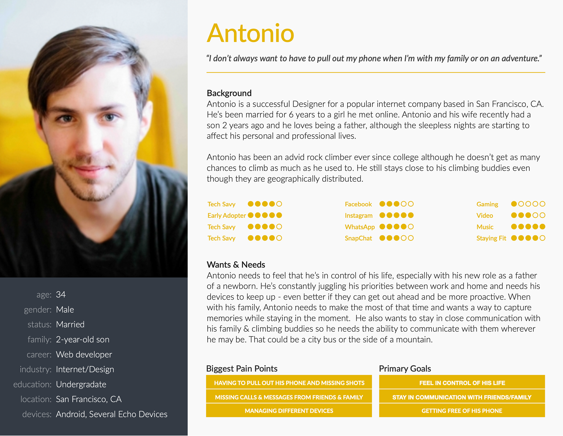
Recognizing the lack of a shared understanding of our target users within the internal teams, I took the initiative to bridge this gap by building user personas based on the customer research provided by Luxotica. While the research from Luxotica focused primarily on marketing and sales aspects, I sought to delve deeper and understand our customers from a design perspective.
Using the available research as a foundation, I conducted additional user interviews, usability tests, and surveys to gather insights directly from our target audience. This allowed me to gain a deeper understanding of their needs, preferences, behaviors, and pain points. By combining this firsthand knowledge with the existing research, I was able to create comprehensive user personas that represented different user archetypes and their unique characteristics.
These user personas served as a valuable tool for the organization, enabling teams to empathize with and design for specific user groups. The personas provided insights into the users' motivations, goals, and challenges, helping us align our design decisions with their needs and preferences. This shared understanding of our target users fostered collaboration and ensured that our designs were user-centered.
By building user personas within the organization, we were able to shift the focus from a purely marketing and sales perspective to a holistic design perspective, enabling us to create a more tailored and meaningful user experience for our customers.
Round two of the iterative design process
With the insights gained from the previous design efforts and the creation of user personas, it was time to regroup with the Product Management team and reevaluate the requirements for the project. I understood that the initial approach had its limitations and it was crucial to iterate and refine the design based on the new insights and understanding we had gained.
In collaboration with Product Management, we conducted a thorough analysis of the feedback received from users, stakeholders, and the market. We revisited the project goals and objectives, considering the user personas and their specific needs and preferences. This process allowed us to identify the areas that needed improvement and to redefine the design requirements accordingly.
Based on these new requirements, we embarked on an iterative design process. We explored different design concepts, wireframed new user flows, and created prototypes to visualize and test the proposed solutions. The iterative approach allowed us to gather feedback early and often, ensuring that the design was moving in the right direction and addressing the identified pain points and user needs.
Throughout this process, close collaboration with Product Management was maintained to align the design iterations with the overall project goals and business objectives. Regular design reviews and feedback sessions helped refine the design further and ensure that it met both user expectations and business requirements.
By examining the new set of requirements and iterating on the design with a fresh flow, we aimed to create an improved user experience that aligned with the needs and expectations of our target users. This iterative process allowed us to refine and optimize the design based on user feedback, ensuring that the final solution would meet both user needs and business goals.


Taking the design in a new direction
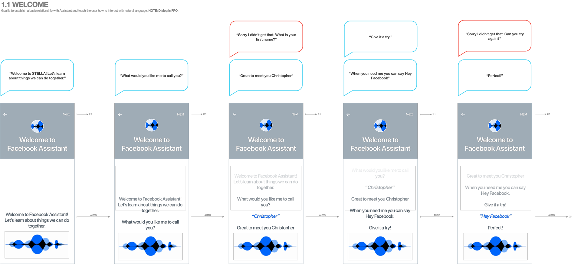
With the companion app team making significant progress in designing the app and establishing a cohesive visual language, and the Assistant brand team finalizing the brand mark and color palette, it was the perfect opportunity to merge my previous designs with their work. This collaboration would ensure consistency and alignment across all touchpoints of the customer experience.
I began by closely examining the visual language and brand elements developed by the companion app team and Assistant brand team. I identified key design components, such as typography, iconography, color schemes, and UI patterns, that could be incorporated into our previous designs for the OOBE. This allowed us to create a seamless and unified experience for users as they transitioned from the companion app to the Assistant setup and product tour.
By leveraging the established visual language and brand elements, we integrated them into our design mockups and prototypes. This involved updating the UI elements, applying the brand colors and typography, and ensuring a consistent look and feel throughout the user journey. The aim was to create a cohesive and recognizable experience that aligned with the overall Facebook brand and represented the Assistant product effectively.
Throughout this process, close collaboration and communication with the companion app team and Assistant brand team were vital. Regular meetings, design reviews, and feedback sessions helped ensure that the designs merged seamlessly and maintained consistency with the broader product ecosystem. Any necessary adjustments or refinements were made collaboratively to ensure a unified and polished user experience.
By merging my previous designs with the progress made by the companion app team and Assistant brand team, I was able to create a visually cohesive and aligned experience for users. This collaboration helped establish a strong and recognizable brand presence for the Assistant product within the Facebook lineup, while maintaining a seamless transition for users across different touchpoints of the customer journey.

How did I solve the problem?
Building trust with the customer
Indeed, timing played a crucial role in the design process, particularly in the context of the OOBE. We recognized that the success of the experience hinged on effectively presenting information to users at the right moments, ensuring a smooth and engaging journey while building trust and respecting their time.
One of our main considerations was to avoid overwhelming the customer with too much information upfront. We understood that introducing complex features or requesting sensitive permissions too early in the flow could lead to a breakdown of trust. Instead, we focused on gradually introducing information and functionalities in a logical and user-friendly manner. By carefully sequencing the content and interactions, we aimed to build a sense of familiarity and comfort with the wearable device and the Facebook Assistant.
Furthermore, we paid close attention to the relevance and necessity of the information provided. Redundancy was avoided to ensure that users weren't bombarded with repetitive content. We made sure that each piece of information and interaction within the OOBE had a clear purpose and contributed directly to the user's goal of becoming familiar with the features and functionality of the wearable device.
Respecting the user's time was also a priority. I strived to create a streamlined and efficient experience by eliminating any unnecessary steps or interactions. By focusing on the essential elements and actions required for onboarding and product understanding, we aimed to optimize the user's time investment and maintain their engagement throughout the process.
Throughout the design process, I conducted user research and gathered feedback to validate our approach to timing. By understanding user expectations, preferences, and pain points, we were able to refine the flow and ensure that the timing of information and interactions aligned with their needs and expectations.
In summary, timing played a crucial role in designing the OOBE. I carefully considered the sequence of information, the introduction of features, and the minimization of redundancy to build trust, respect the user's time, and deliver a seamless and engaging experience.
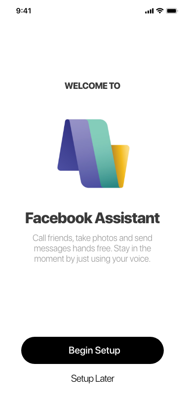
Using the companion app to aid the product tour
This approach allowed users to go through the tour and learn how to use their Assistant functions without necessarily granting microphone permissions right away, which helped address concerns of overwhelming information or privacy issues.
By making the Assistant tour optional, users had the flexibility to choose whether or not they wanted to engage in it. Archiving the learning modules in the Help section of the app also provided a convenient way for users to access the information and complete the modules at their own pace, even after the initial onboarding process.
The sliding panel interface for voice interactions was a thoughtful addition. By incorporating this feature, users who hadn't granted microphone permissions could still interact with the Assistant through alternative means. This ensured that they could fully engage with the learning module and understand how to utilize the Assistant's features, even if they were not comfortable using voice commands.
Overall, my design approach demonstrated a user-centric mindset, providing users with choices and considering their preferences and comfort levels. By accommodating different user scenarios and enabling them to complete the learning modules and explore the Assistant's functionality at their own pace, I created a more inclusive and flexible experience.
By leveraging the companion app as the central hub for the experience and considering the varying permissions and preferences of users, I was able to strike a balance between providing guidance and respecting user autonomy.


Final Release
What were my key takeaways?
The importance of being flexible and agile
Since my early days at Palm, I have been reminded of the challenges that arise when designing experiences for hardware that is constantly evolving. However, I have also realized the importance of flexibility and utilizing my design skills to navigate through ambiguity and demonstrate what is possible to the teams involved.
In order to drive the project forward and effectively communicate with stakeholders, I have found creative ways to showcase potential outcomes. For instance, I have leveraged prototyping tools, such as GoPro videos, to effectively illustrate the desired user experience. By using these tools, I can effectively demonstrate the envisioned interaction and provide a tangible representation of the intended user journey.
This approach not only helps in conveying ideas but also encourages collaboration and engagement from the teams involved. By showing stakeholders the potential outcomes through tangible examples, it becomes easier to align everyone's vision and move the project forward.
In conclusion, my experiences at Palm have reminded me of the challenges posed by evolving hardware. However, by staying flexible, embracing ambiguity, and utilizing creative prototyping techniques, such as GoPro videos, I can effectively communicate and drive projects forward, fostering a seamless user experience that aligns with stakeholders' expectations.
The importance of shared knowledge
From the early stages of my career, I recognized the immense value of thoroughly understanding our customers. It is crucial to delve into their needs, desires, struggles, and pain points, forming the foundation of a "user-centered" design approach. It's not only important to possess this knowledge but also crucial for teams to collectively agree on this data and incorporate it into their daily discussions.
During this project, it became evident that different teams within Facebook had diverse perspectives when it came to understanding the customer. This highlighted the need for collaboration between Design and Product Management to ensure that user personas are effectively socialized throughout the entire team. By doing so, we establish a shared understanding of the individuals we are building the product for.
Creating a cohesive understanding of our target audience enables the team to align their efforts, priorities, and decision-making processes. It ensures that every team member is working towards a common goal and consistently considering the needs of the user. This shared understanding facilitates effective communication, enhances collaboration, and ultimately leads to the development of a product that truly resonates with our customers.
In summary, knowing our customers thoroughly is paramount, and it is the responsibility of Design, in partnership with Product Management, to disseminate user personas throughout the team. This fosters a shared understanding of the target audience and empowers the team to create products that meet their needs and aspirations.