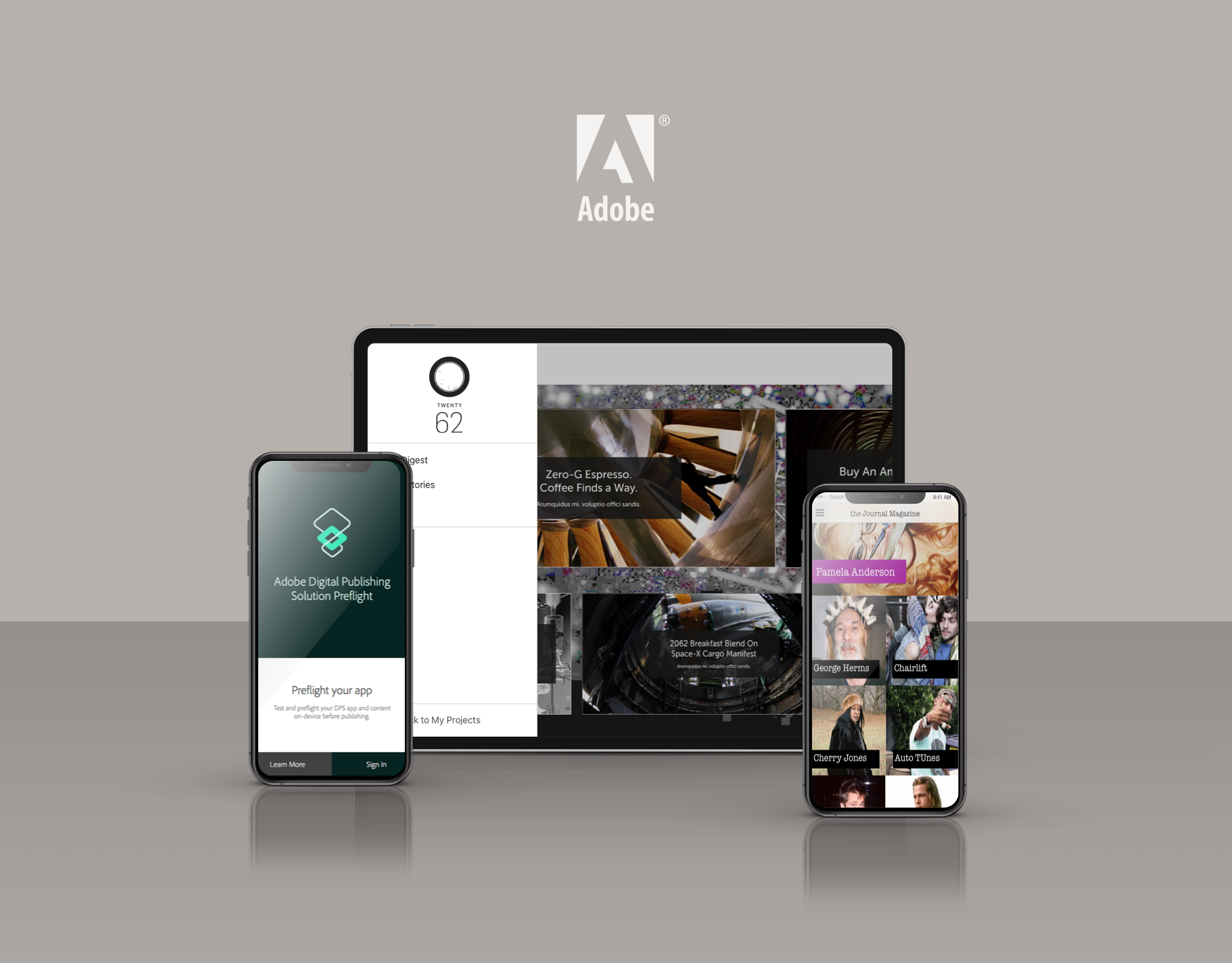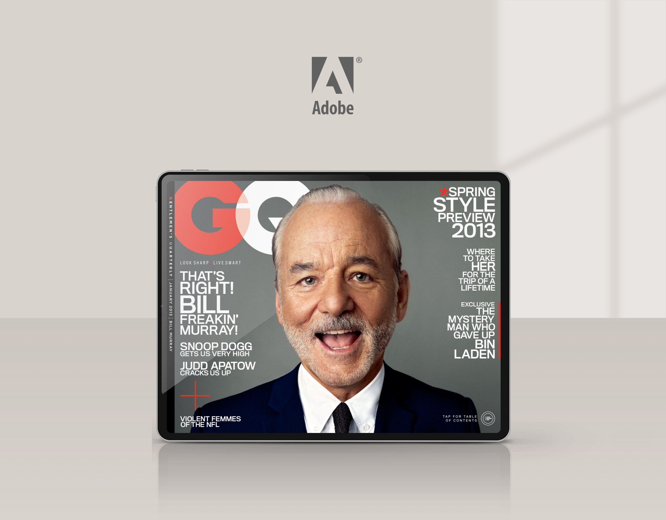
What is the DPS iOS viewer?
In Adobe's Digital Publishing Suite of products, the Viewer is the window into which our customers readers consume content. DPS gives publishers the ability to create a branded app experience through which they can deliver their digital editorial content quickly and easily. The viewer provides everything magazine fans need to experience digital magazine content. It allows them to browse digital magazine content, purchase individual issues and manage subscriptions. It also provides all the functionality needed to navigate, save and interact with digital content.
What did I contribute?
As a Design Lead for Adobe DPS I worked closely with the Product and Development teams on the design, definition and delivery of the design solution. I created diagrams and wireframes to communicate design ideas and used visual design tools to create the high-resolution mockups.

What was the problem?
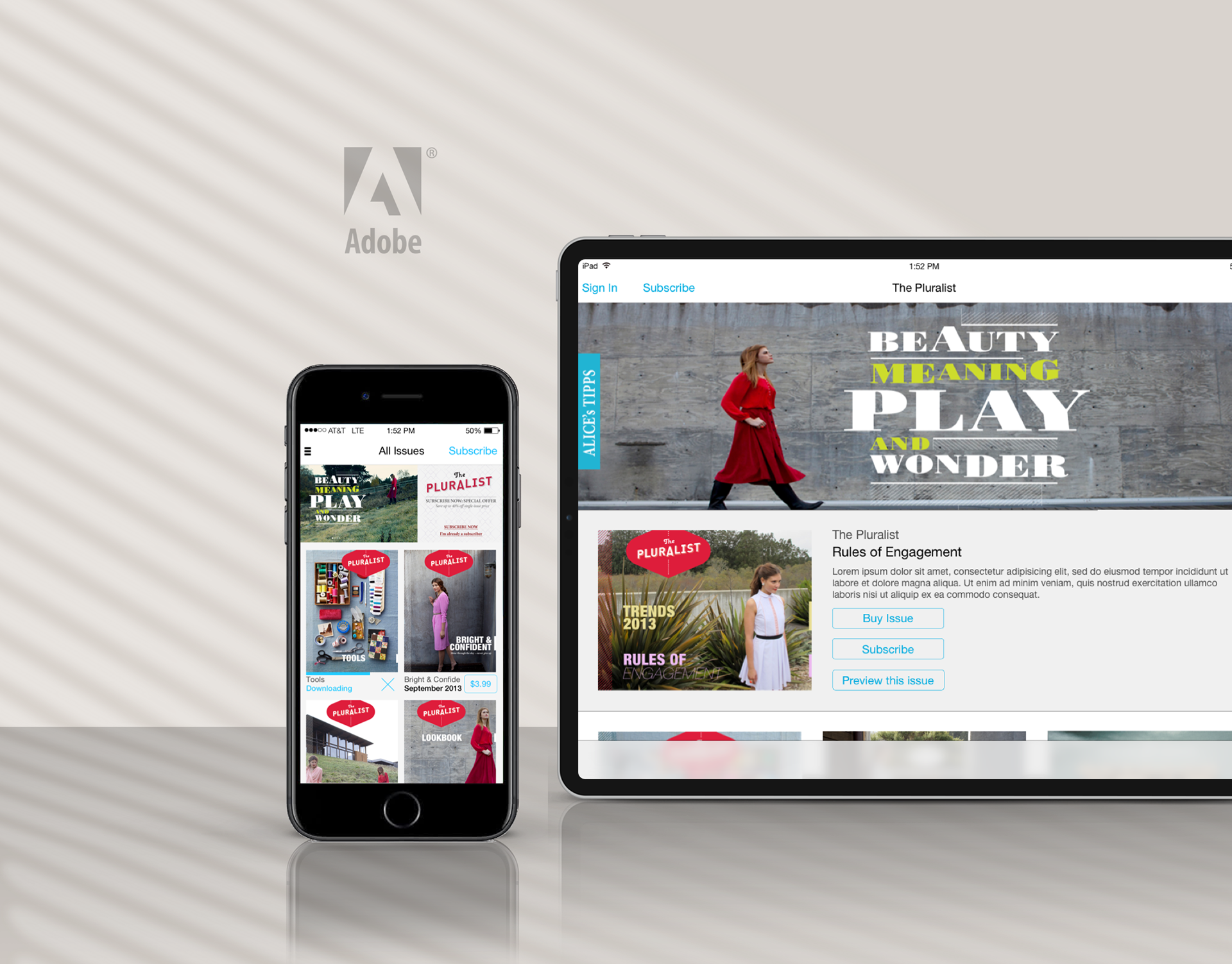
The introduction of iOS 7 introduced a significant redesign of the iOS user interface which made our existing user experience look dated. The goal of this project was to not only refresh the UI with iOS 7's new visual language but to also introduce new components which helped improve the user experience and solve usability issues with the current design. I designed a new navigational method called a “Drawer” which centralized the navigation in into one collapsable area and allowed our publishers more freedom to customize the interface.
How did I execute on the goals?
The first order of business was to work with our Product management team on a clear set of requirements for this release. The requirements ended up as a combination of features that our customers were requesting as well as requirements the design team had to comply with iOS 7 guidelines.
Once requirements were defined, clarified and agree upon, I set out to explore design solutions to each feature. Using the iOS 7 UI guidelines as a reference I began to draw mockups of the UI improvements.
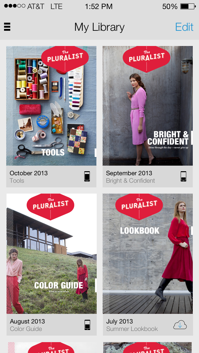
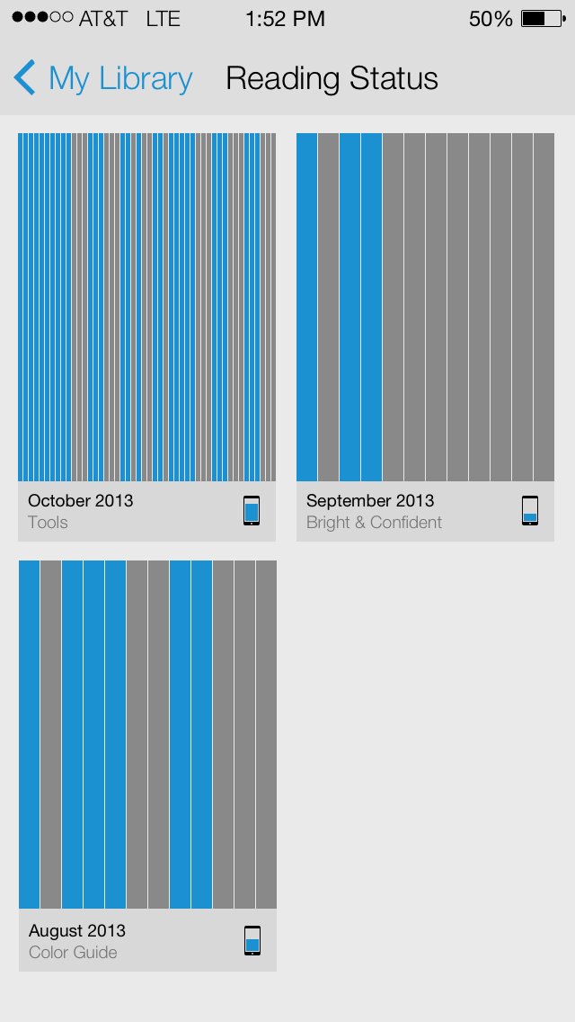
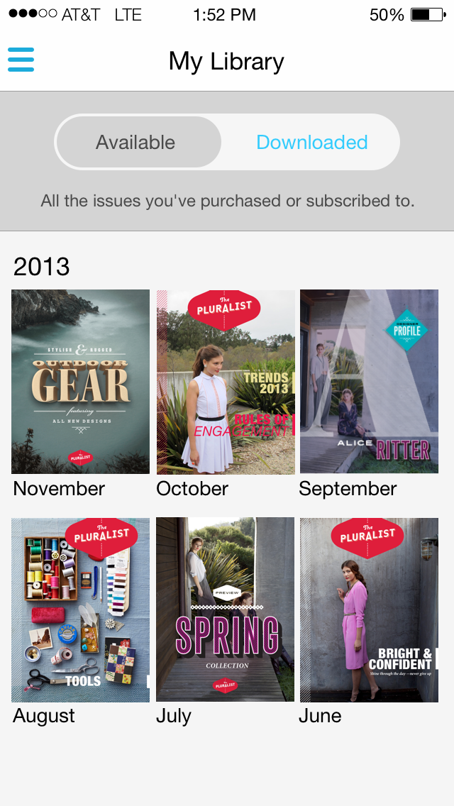
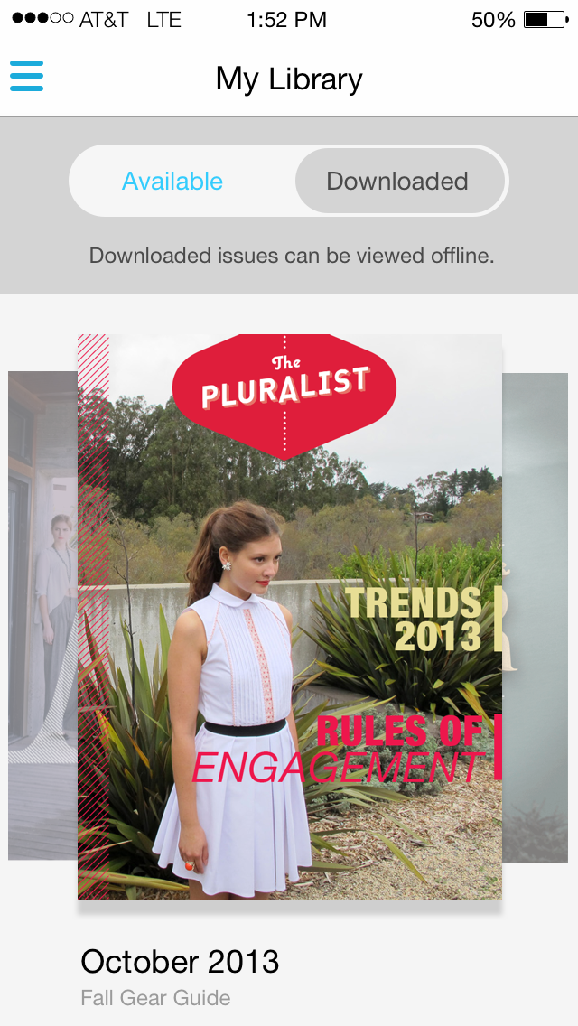
Updates and improvements to My Library
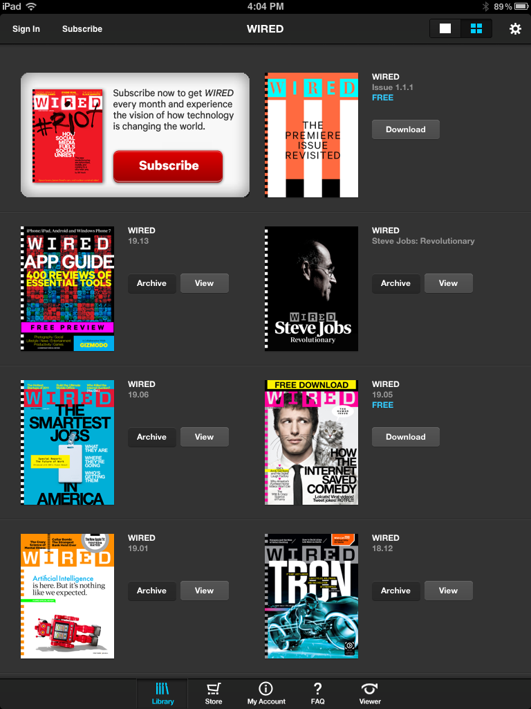
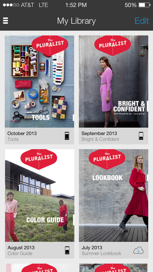
One of the biggest areas of reader complaints were around managing their magazine issues in the Library. Customers wanted the ability to manage which issues they kept, which ones they archived and wanted visual indicators to show either.

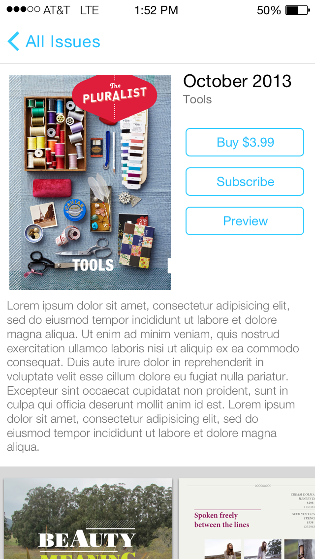
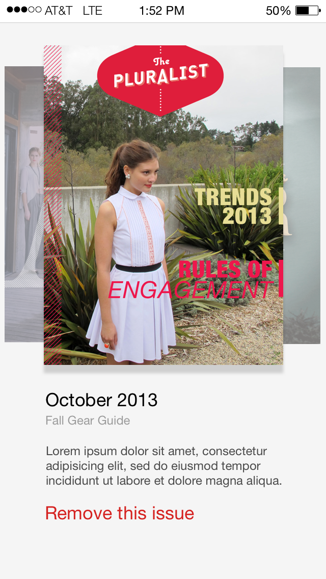
Issue preview pane
Another new component that I introduced was the issue preview pane. I used this preview pane to take some functions off the Library view which would help declutter that interface as well as give readers a focused experience in which to make a purchase decision.


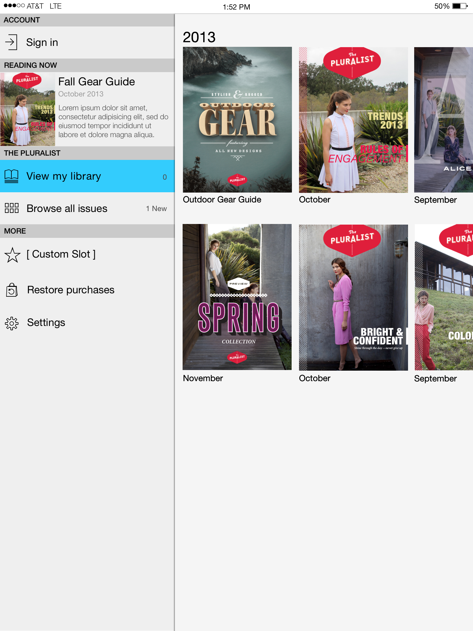
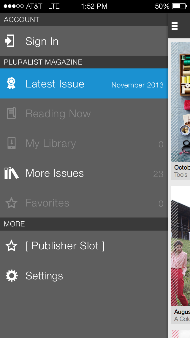
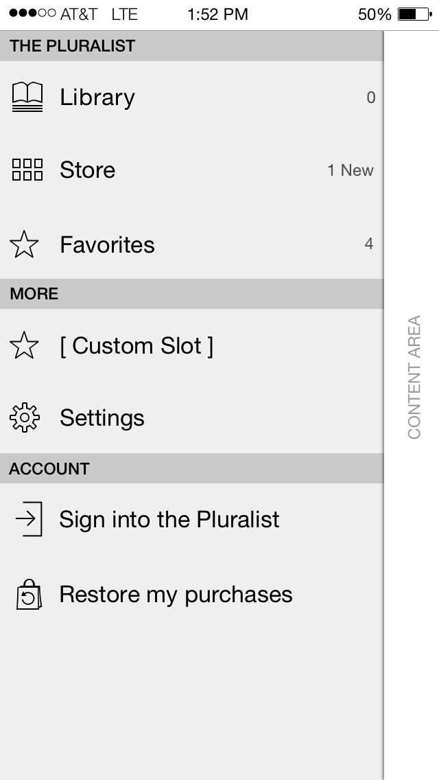
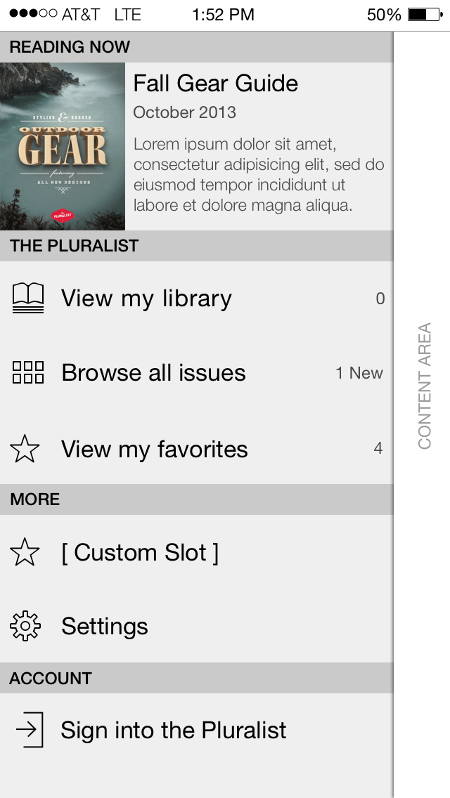
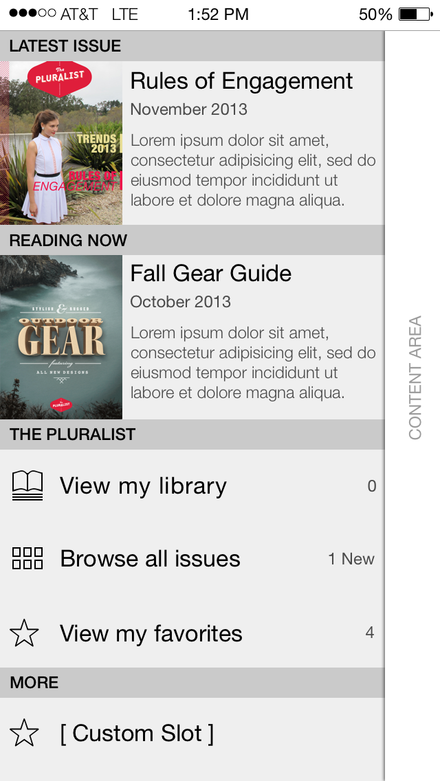
Navigation drawer
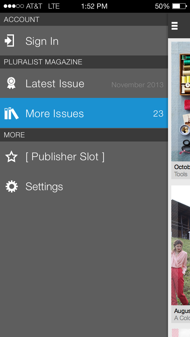
One of the biggest usability issues had to do with our primary navigation. Previously the app had only one Library view which showed both, issues to purchase and issues already purchased. Readers couldn't tell which was which. I introduced a navigation drawer which helped split the Library into several different views which would help the readers navigation their experience. Working with the Product team I also introduced a customizable slot which could be used by the publisher for extra content.
First use experience, no account.
First use, alternate design

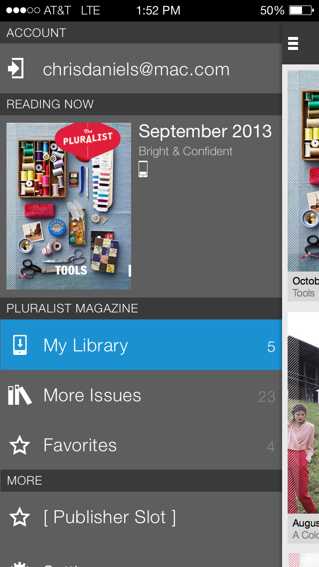
No account with purchases


Through an iterative review process with design leadership and product management we eventually moved from the typical dark theme to a more iOS-style light theme.
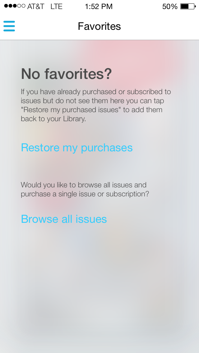
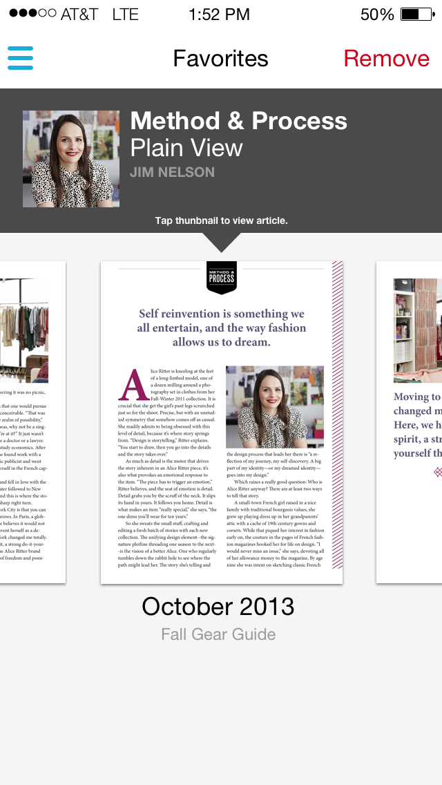
Allowing customers to save favorites
Another sticking point with readers was the inability for them to save important content so as part of this effort, we added the ability to save Favorites.
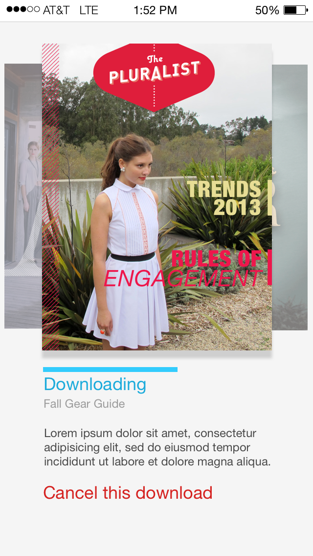
Showing what's been downloaded vs. what's been purchased
Another major sticking point for readers was the inability to discern between magazine issues they've purchased or previewed and issues they've downloaded. Issues were very large download files and it required a significant time investment to download an entire issue. For this reason I introduce a very prominent toggle to the Library view which allows readers to toggle between content which has been downloaded and available for immediate viewing versus content they have purchased but does not reside on device.
Defining Use Cases and user flows
As part of my design process I always communicate use cases and user flows. Use Cases help focus the design solution on only what's important to the user and user flows make sure the experience is cohesive.
How did I solve the problem?
By combining the visual language of a new iOS release and introducing features which helped to eliminate glaring usability issues I was able to make significant improvement to the entire user experience.
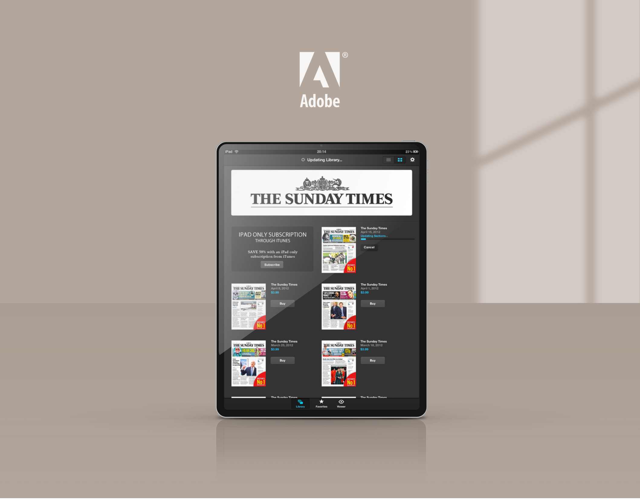
The before and after photos