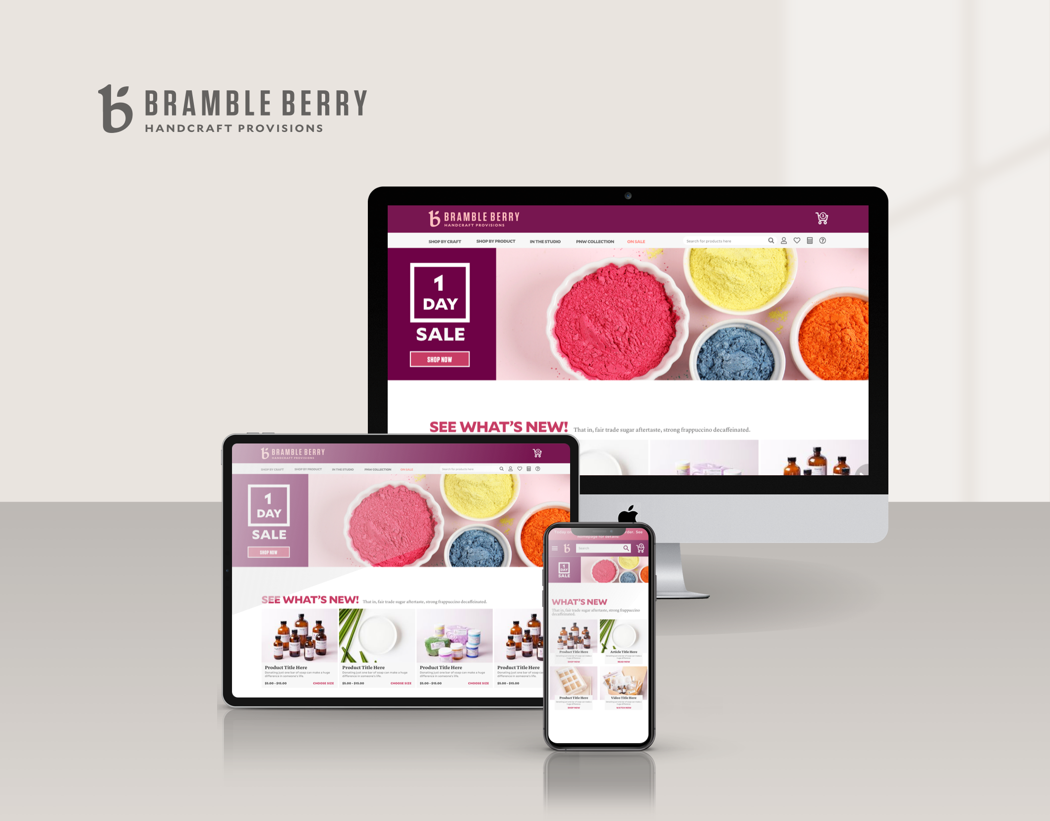
What is West Elm - Style Ideas?
In a strategic collaboration, West Elm joined forces with an external vendor specializing in an advanced algorithm capable of recommending similar items based on style. This familiar concept, commonly seen on fashion websites where outfits are dynamically styled, became the inspiration to harness this technology's potential. The aim was to create a captivating shopping experience by generating curated "rooms" based on a single item. These visually appealing rooms were thoughtfully showcased on the Product Info page, enabling customers to explore and shop for complementary products with ease. By leveraging the power of this innovative technology, West Elm sought to enhance customer engagement and simplify the process of discovering and selecting cohesive home decor solutions.
How did I contribute?
In my role as the Lead UX Designer for West Elm, I collaborated closely with the Executive team and the Site Manager responsible for implementing this feature. Working in tandem, we liaised with both internal and external development partners to navigate the technical requirements and constraints of the algorithm. Armed with these insights, I embarked on creating an experience that seamlessly integrated with the visual aesthetics of West Elm's overall styling. By crafting visual mockups and interactive prototypes, I ensured a visually consistent user experience that harmoniously blended with the brand's identity. This meticulous design process, driven by close collaboration and a deep understanding of the technical landscape, laid the foundation for an immersive and visually cohesive experience for West Elm's customers.
What was the problem?
The primary objective of implementing this feature was to elevate the average transaction value (ATV) by simplifying the process for customers to explore products that align with their preferred style. The design challenge entailed creating a self-contained and seamless experience that empowered customers to interact with this feature effortlessly. Additionally, a key focus was optimizing the placement of this feature on the Product Info Page (PIP) to maximize customer engagement. By strategically considering the user flow and visual hierarchy, we aimed to enhance discoverability and ensure that customers could easily access and engage with this feature, ultimately driving higher customer satisfaction and increased ATV.
How did I execute on the goals?
We initiated the process before receiving clear requirements from our external partner. To ensure progress, I proactively delved into exploring various grid options, anticipating that we would be working with a grid layout to display products. By taking this proactive approach, we aimed to lay the groundwork for the visual structure and layout of the feature, setting the stage for future collaboration with our partner. This proactive exploration allowed us to efficiently utilize our time and resources, enabling us to adapt and align the design as the requirements from our partner became clearer, ultimately facilitating a more seamless and efficient design process.
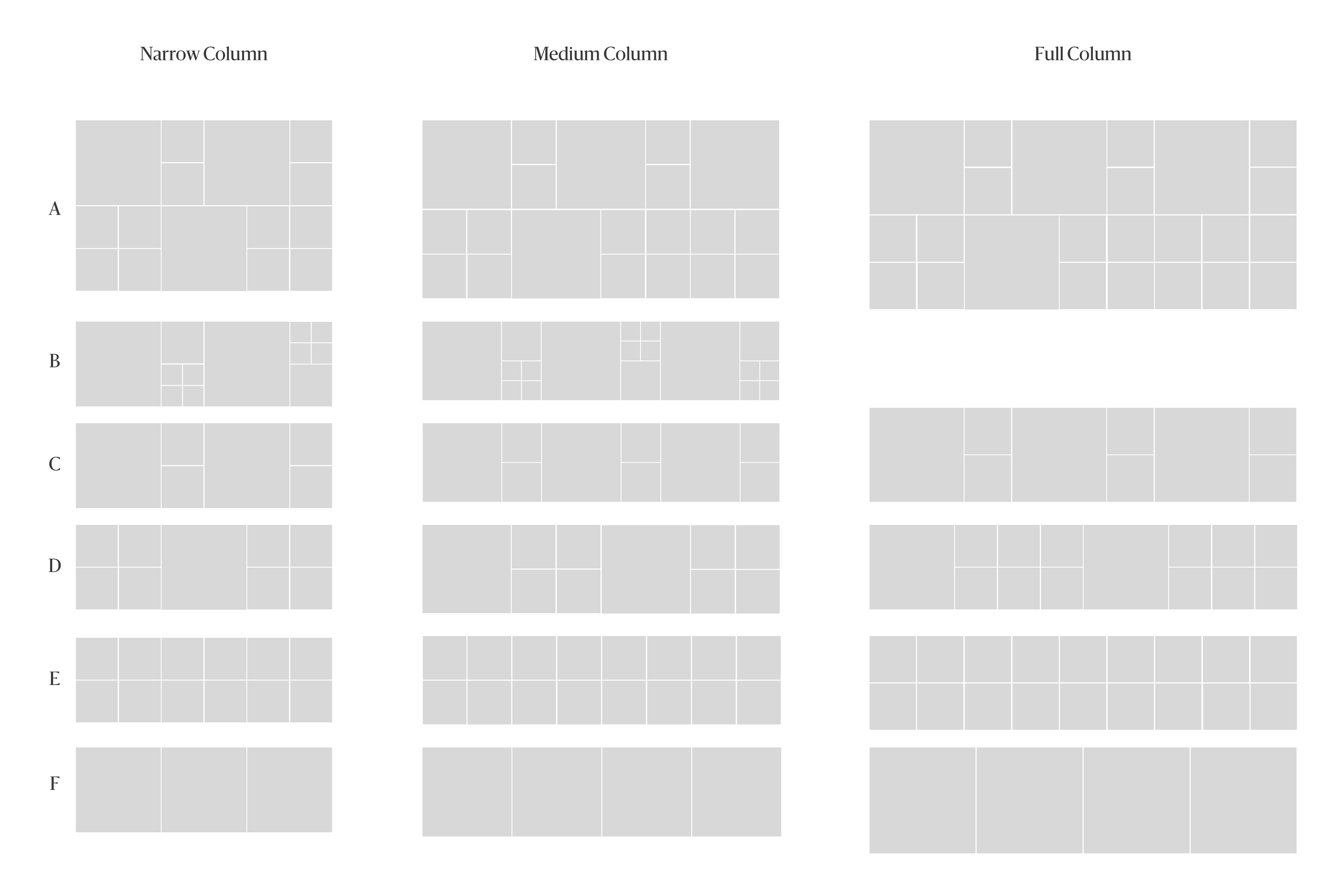
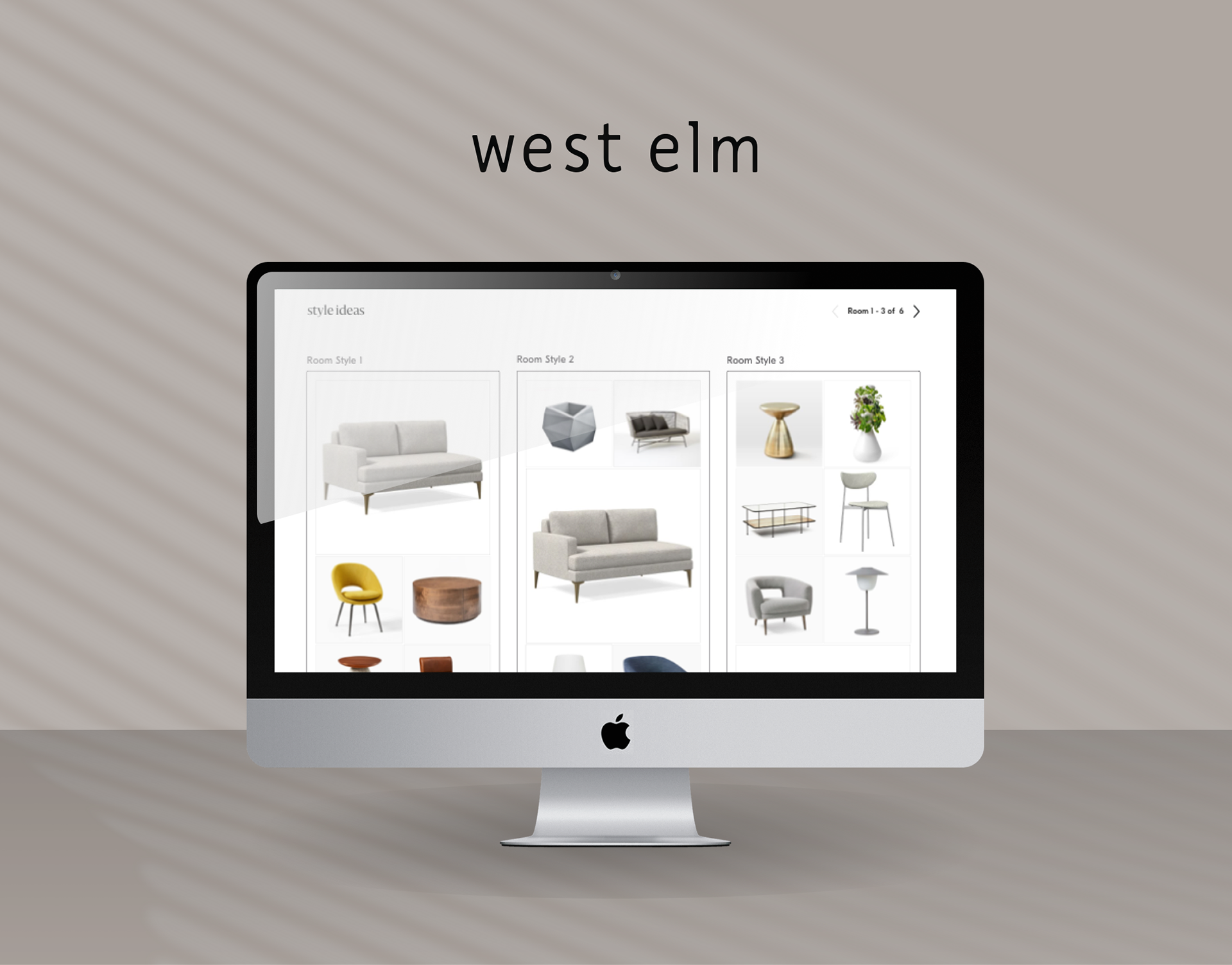
Explore how to display products in a grid view
The objective of this exercise was to thoroughly explore various permutations of a grid view, seeking to determine the optimal combination of large, medium, and small-sized thumbnails, as well as the alignment options of vertical or horizontal. By engaging in this exploration, our aim was to identify the most effective layout that would enhance the overall user experience and visual aesthetics. Through meticulous examination and experimentation, we sought to strike a balance between showcasing product details and maximizing the efficiency of space utilization. By thoroughly exploring these different permutations, we aimed to make informed design decisions that would result in a visually appealing and user-friendly grid view, ultimately improving customer engagement and satisfaction.

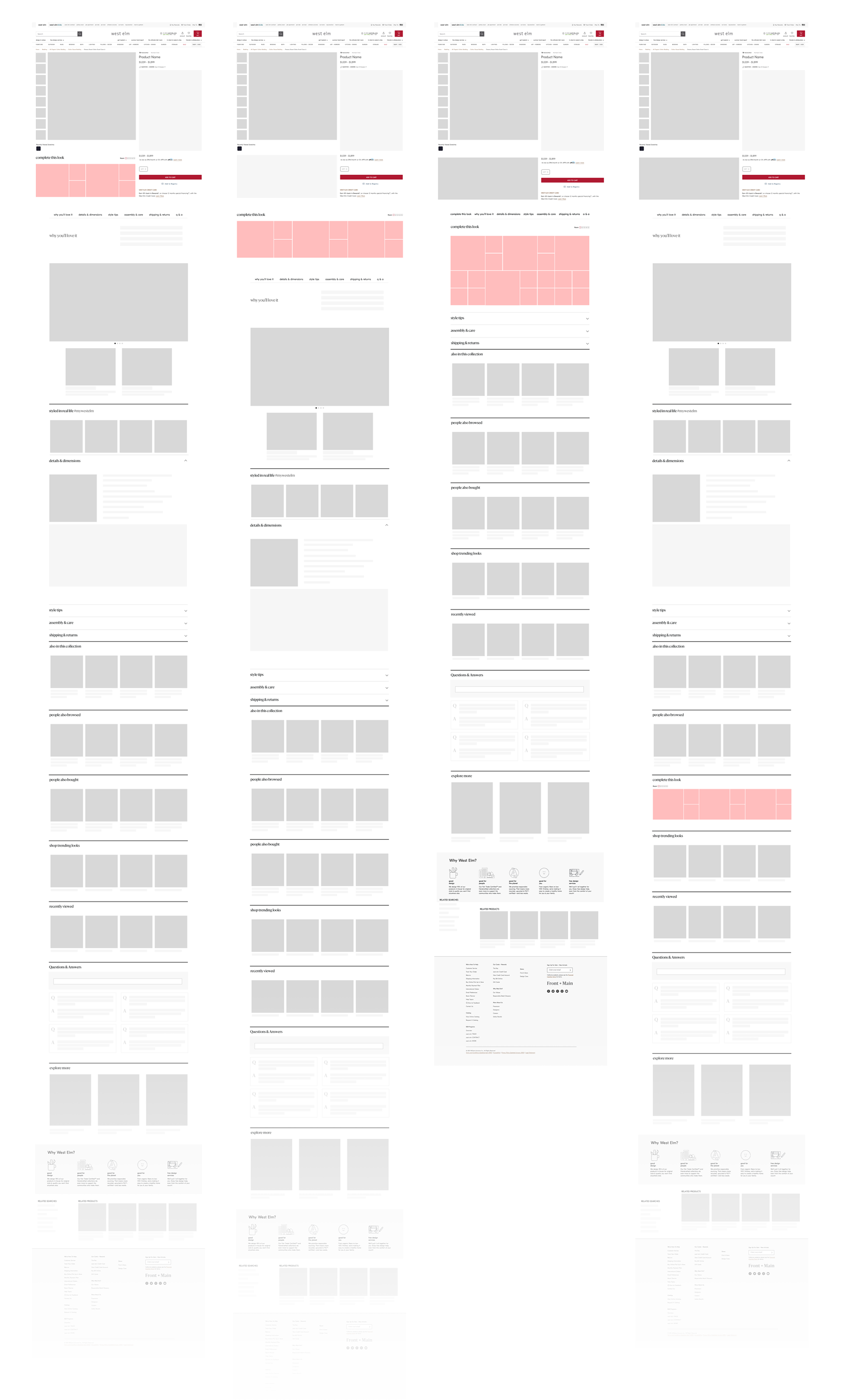
Deciding on page placement
The next crucial decision entailed determining the placement of this feature within the already crowded Product Info Page (PIP). To tackle this challenge, I employed wireframing techniques to create multiple options that adhered to various Information Architecture principles. Each version was thoughtfully crafted, taking into consideration the optimal positioning to maximize usability and engagement. These wireframe-based options were then presented to the leadership team, providing an opportunity to gather valuable feedback and insights. By leveraging their expertise and input, we aimed to collectively determine the most effective placement that seamlessly integrated with the existing PIP layout. This collaborative process allowed us to make informed decisions that would enhance the user experience and ensure the feature's visibility, ultimately resulting in an optimized and engaging PIP for our customers.
Visual design with imagery
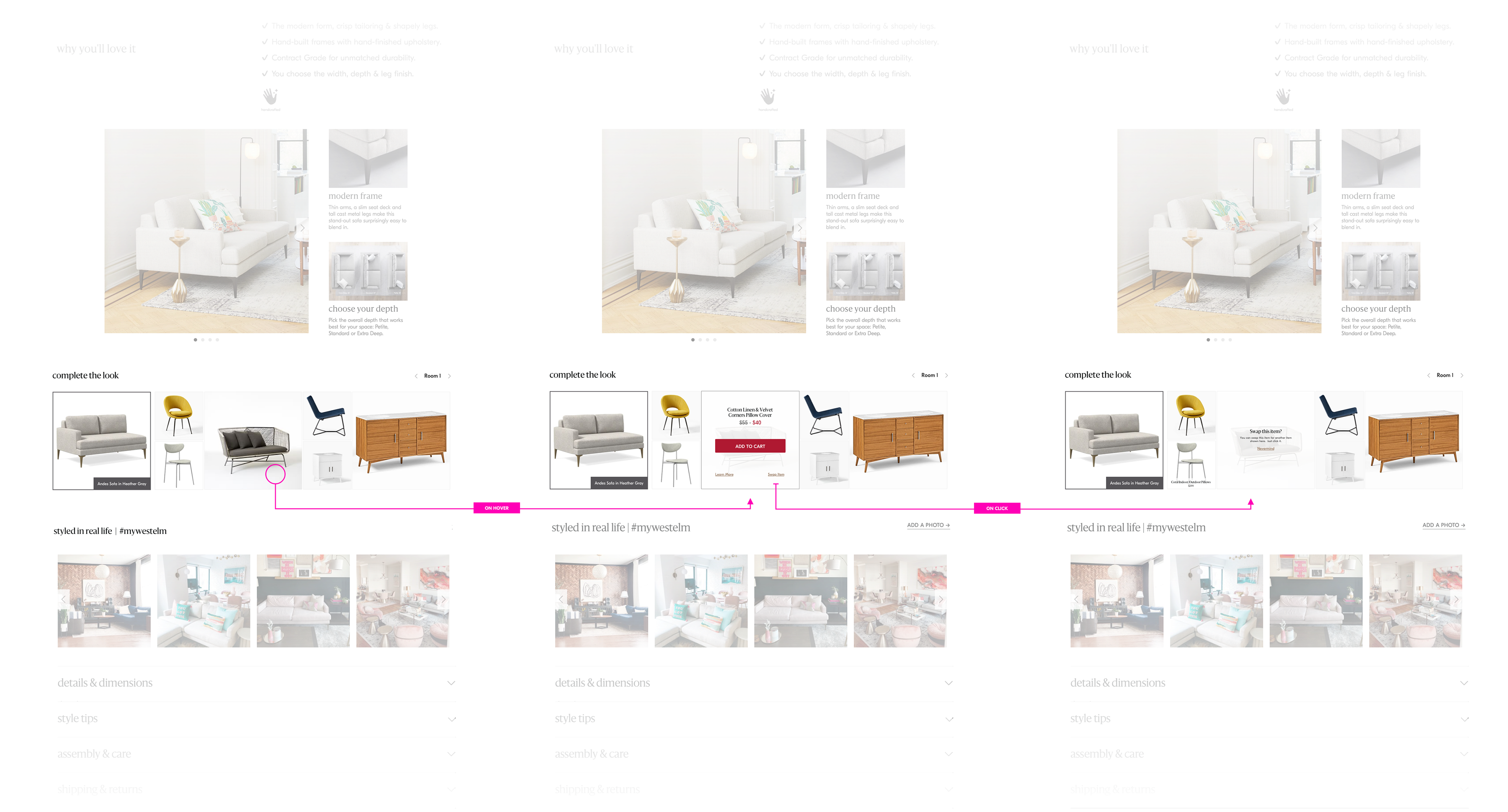
Another crucial decision we confronted was selecting the type of imagery to be used in promoting each product. At West Elm, we had two categories of imagery, each with its own distinct advantages and limitations. White Silhouettes provided a clean and uniform aesthetic, but they were not as effective in conveying the scale of the product. On the other hand, Lifestyle images offered inspirational visuals and better demonstrated scale, yet they could potentially introduce visual clutter. To determine the most suitable approach, I conducted experiments to assess the effectiveness of each option. Based on the results, I presented a range of options to the leadership team, seeking their input and expertise. By involving the leadership team in this decision-making process, we aimed to strike a balance between visual consistency, product scale representation, and aesthetic appeal. This collaborative approach ensured that the chosen imagery would effectively promote the products and enhance the overall customer experience.

Designing the customer interactions
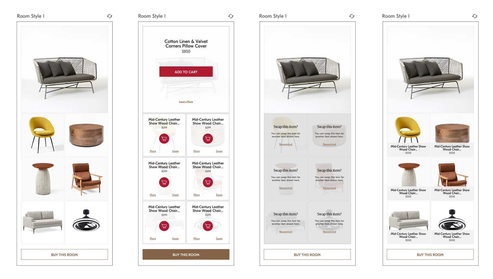
Our collaboration with external partners introduced advanced technology that enabled us to incorporate engaging micro-interactions with the displayed products. For instance, customers had the freedom to effortlessly swap out a single item in a room for another item of similar style. Leveraging the technical requirements provided by our partners, I crafted an interaction model that seamlessly integrated with the existing West Elm site, ensuring consistency across the user experience. When it comes to intricate interactions, my preference has always been to prototype the design, as it proves to be the most effective way to convey the nuanced details. For this purpose, I have found Adobe's XD design tool to be the ideal choice, offering a combination of rapid prototyping capabilities and robust interactive features. By employing this tool, I was able to create dynamic prototypes that accurately communicated the envisioned micro-interactions, ensuring a seamless and immersive experience for our customers.
Being flexible and agile with design
Upon receiving feedback from leadership expressing the desire to display more rooms per page, I promptly adapted my design approach by pivoting to a vertical orientation and crafting mockups for further evaluation. I advocated for this design for two compelling reasons. Firstly, the vertical orientation offered a unique visual distinction within our Product Info Pages (PIPs), effectively highlighting this section and drawing attention to the showcased rooms. Secondly, a vertical layout would seamlessly adapt to mobile viewports, ensuring a consistent and optimized user experience across different devices. By emphasizing these two points, I presented a persuasive argument for the chosen vertical orientation, aligning with both the visual appeal and the responsiveness required for optimal mobile usability.
Using data to drive design decisions
To drive the page placement decision, we employed a rapid experimentation approach. Initially, we determined what we believed to be the optimal placement on the page and released that version of the widget for a four-day period to gather engagement data. However, the initial test results did not meet our expectations. As a result, we made the strategic decision to relocate the placement higher on the page and conducted another round of testing. By iterating based on real-time data and user feedback, we aimed to refine and enhance the widget's visibility and performance. This iterative process allowed us to make data-driven decisions and continually improve the placement to maximize engagement and achieve our desired outcomes.
How did I solve the problem?
Embracing the principle of "Show early & show often," the involvement of executive leadership at West Elm in design details made it crucial to seek feedback at early stages and maintain a continuous feedback loop to ensure design alignment. This project underscored the importance of adaptability, as swift pivoting was necessary when directions changed. Utilizing data as a compass to validate design decisions played a pivotal role. Releasing an initial version of the feature early on enabled us to gather valuable insights on usage and engagement. While assessing the impact of this feature, it was equally important to monitor potential cannibalization of other PIP features. To effectively convey the intricacies of complex interactions, the use of interactive prototypes proved indispensable. Creating prototypes with rollovers and nested behaviors facilitated comprehensive communication, ensuring a shared understanding of the design nuances among stakeholders. This approach fostered collaboration and alignment, leading to more refined and impactful design outcomes.
What were the results?
The good
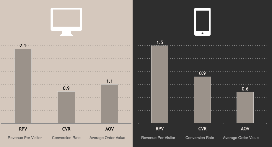
During the pilot program, which ran from July 28 to August 23, we observed promising results with positive lifts across various metrics. Notably, for customers who engaged with the widget, we witnessed a remarkable 35% increase in Units per Transaction (reported as 3.57 compared to 2.64). Additionally, on desktop devices, we observed significant lifts in Average Unit Retail (AUR) categories that are often focal points of a room's design. Specifically, we observed a 2% increase in Furniture and an impressive 6.6% increase in Rugs. These findings highlight the effectiveness of the implemented widget in driving customer engagement, increasing transaction values, and elevating sales in key product categories.
The not so good
Due to the placement of the Style Tips widget, we observed a decline in the performance of other merchandising and discovery modules on the page. As the Style Tips widget occupied a prominent position, it pushed down the visibility and prominence of other modules, resulting in decreased engagement and performance for those modules. This highlights the importance of carefully considering the overall page layout and balancing the visibility of various elements to ensure optimal performance and user experience.