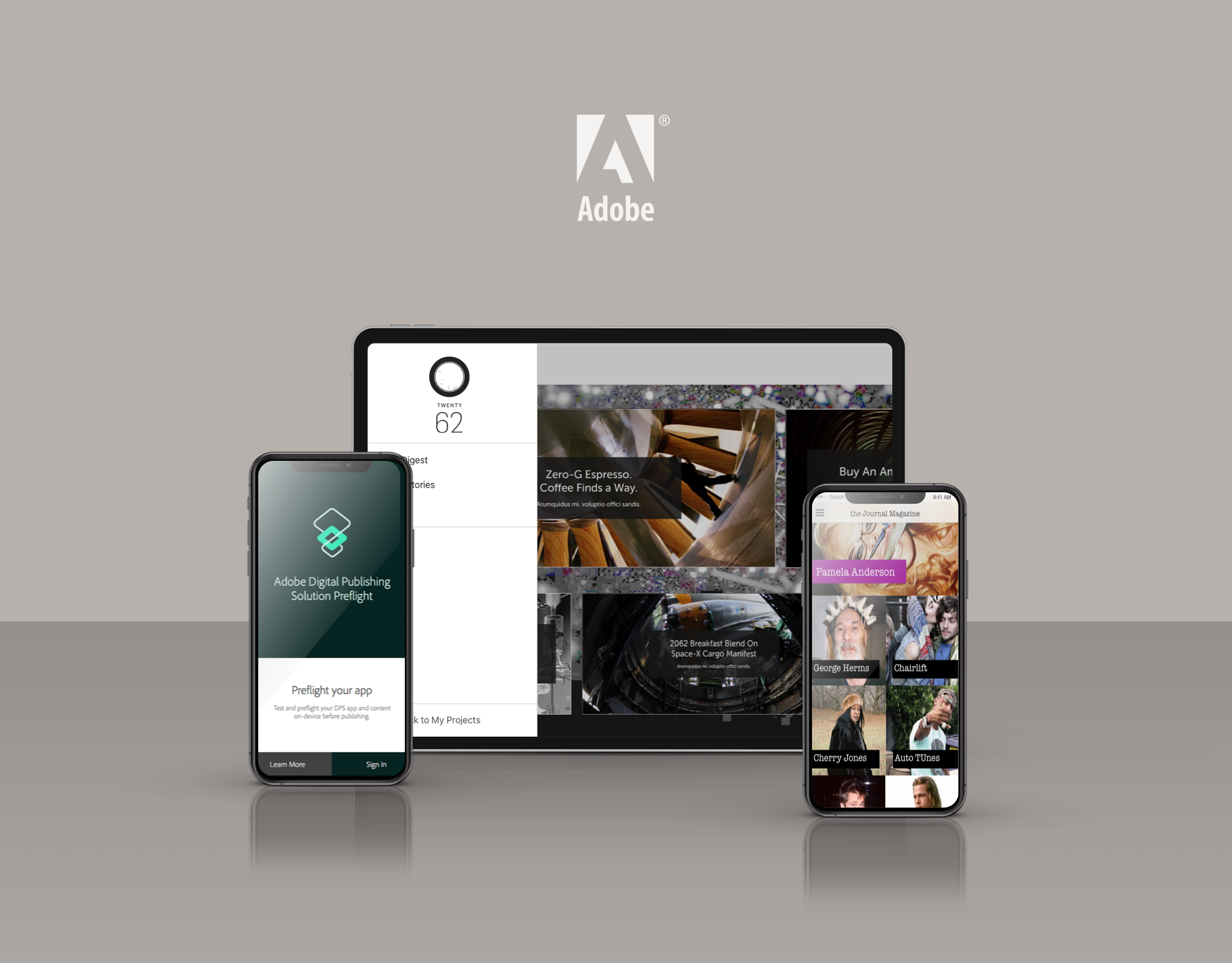
What is DPS Viewer for Android?
In Adobe's Digital Publishing Suite of products, the Viewer is the window into which our customers readers consume content. DPS gives publishers the ability to create a branded app experience through which they can deliver their digital editorial content quickly and easily. The viewer provides everything magazine fans need to experience digital magazine content. It allows them to browse digital magazine content, purchase individual issues and manage subscriptions. It also provides all the functionality needed to navigate, save and interact with digital content.
What did I contribute?
Each designer on our team had primary ownership of the viewer for a specific mobile platform. I was the Design Lead for our Android experience. As Design Lead for the DPS Android platform it was my responsibility to translate the core DPS experience to native Android devices while adhering to Google's Material Design guidelines.
What was the problem?
As a Design Team, it was important for us to provide a consistent user experience for the DPS content viewer apps across all of our three supported platforms. We worked hard to create consistent patterns while also adhering to the design principles of each respective platform.
How did I execute on the goals?
Since the primary app structure was already defined on other platforms there was no need to re-invent the wheel. The process mostly involved converting all of the existing viewer app screens to the native Android screen sizes.
The Android overflow menu
There were only a few areas where Android default patterns gave its users more benefits than its iOS brothers. One of those components was the Android overflow menu. Adding the small, 3-dot icon to each issue cover gave users the ability to perform contextual commands to issues in their Library.

The Android hardware navigation buttons
Android devices come with fixed hardware navigation buttons which allowed users to navigate between apps and within apps quickly and easily. These new pattern needed to be accounted for and defined in the viewer experience. For example, a single-tap to the back button would bring the user back to their DPS Library but a double-tap would exit the app and return them to their Home Screen.
The Android notifications menu
Android had a rich notifications experience where apps could send content or data to the user and display it in a notification. Applying this pattern to the DPS viewer allowed us to notify readers that a new issue had been published and also gave them a one-tap ability to purchase, subscribe or preview the issue.
How did I solve the problem?
I was able to successfully meet the needs of DPS customers using Android devices by creating a user experience which was both consistent with DPS patterns and Material Design guidelines.